Inspired by Anwar Shemza

Walking around the Tate Britain last week we were struck by a wonderful Spotlight Display by Anwar Shemza.

Shemza moved to London from Lahore in 1956. In London he abandoned his illustrative and figurative approach that had brought him acclaim in Pakistan, he had achieved widespread recognition in Pakistan but was unrecognised in London

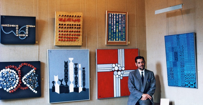
Shemza started his own, new style of compositions which combined calligraphy, Islamic architectural features and abstraction. Some of his influences came from artists such as Paul Klee and we loved the way he blended this abstraction with Islamic artistic traditions.

Springtime Inspiration

Spring is the time of plans and projects

- Leo Tolstoy -

We hope all of our readers had a lovely Easter weekend! For this blog we've drawn inspiration from the Springtime season, looking at places you can visit and some Spring mood board ideas if you're looking to lighten up your interior.

Springtime in London may be a little cloudy at times but nothing is so uplifting as a stunning display of bright yellow daffodils. They inspire poets to take up their pens and as you might have noticed, nature’s colours and imagery is a source of inspiration for us here at Devas Designs. With that in mind, one of our favourite places to visit in the Spring is the 'Wilderness Garden' at Hampton Court Palace for the natural daffodil planting and the formal gardens.

Last year at Decorex we discovered the brand Pooky, who design a range of lighting fittings and lampshades. Their designs are high quality but aim to remain affordable so are a go-to company if you are looking to add some seasonal colour to your home. We love their empire shade below in yellow silk ikat.

As well as auction houses, we also use 1stdibs for sourcing antiques and works of art for our clients. The work on the left is an etching by Henry Moore of a mother and child, we thought the glow of yellow would look wonderful alongside our spring suggestions. On the right is a beautiful work by John Piper in gouache made in the 1950s. If you are trying to add a splash of colour in to your interior, works of art can be wonderful way of changing or creating atmosphere. 

Hilma af Klint: Painting the Unseen at The Serpentine Gallery

This weekend we visited an extraordinary exhibition at The Serpentine Gallery of a Swedish artist Hilma af Klint. While this exhibition has attracted a huge amount of press, prior to this show she was virtually unknown in the UK.

Being a woman, producing pioneering and unconventional artwork such as this, is probably the greatest reason for af Klint's exception from history. She began her career by painting landscapes and portraits and gained some recognition at that time. It was her protestant upbringing and studies of Theosophy however that was the pivotal inspiration for her abstract works - this was also the first religious group in Europe to accept women in senior positions which must have empowered af Klint herself. Between 1906-07 she created her most revolutionary paintings which derived from automatic drawings she produced during seances - some encompass swirling abstract patterns, others follow geometric structured diagrams.

She painted the work below in 1907, years before Kandinsky or Mondrian or Malevich had ventured into abstraction. Looking into her colourful swirls, bold splatters and geometric shapes painted in the early 1900s it is undeniable that af Klint is a true pioneer of abstraction. 

Hilma af Klint was certainly a complex and creative character, drawing on spiritual experiences and unconscious thoughts. This is an unmissable exhibition and an important step in making sure that she gains recognition - open until May 15th 2016.

Painting the Modern Garden: Monet to Matisse at The Royal Academy of Arts

We visited ‘Painting The Modern Garden’ … While Monet is at the centre of this exhibition, there are works by Renoir, Cezanne, Pissarro, Van Gogh, Matisse and Klimt to name a few. The exhibition promises to help you see ‘the garden in art with fresh eyes’ and its doesn’t disappoint.

Interestingly the natural garden subject seems to have enabled many of these avant-garde artists to work with a greater freedom than before, freeing their palettes and their brushstrokes. Throughout he exhibition you are greeted with Monet’s stunning gardens until ending in a grand finale; Monet’s great pastel coloured waterlily paintings.

The exhibition opens with a beautiful comparison - Monet's 'The Artist's Garden in Argenteuil' (pictured below left) is placed beside Renoir's painting of Monet painting in the very garden in Argenteuil (pictured below right). This sets the tone for the exhibition, an affirmative statement about the impact Monet had on his fellow impressionists and hints that he influenced not only the garden subject matter but the act of painting en plein air.  

There are some beautiful works by a less famous name, Spanish artist Santiago Rusinol. His paintings are more structured than the Impressionist works on display and convey spectacular modelling of light, like this work below which evokes the brilliant glow of sunset. 

We thought it would be lovely to also share with you some images of Monet's garden in Giverny. These are the gardens Monet spent nearly forty years in his house in Giverny, a period many argue were his most creative. In 1883 he and his family rented the house with its 2 acre land and by 1890 he had saved enough to buy it and the surrounding land. As an avid gardener himself, Monet worked alongside his gardeners and created precise designs and layouts for his garden's planting, resulting in a stunning display. Over time he built up the land, eventually buying a water meadow which he plated up with water lilies. These became the subject of his best known works and the water meadow is now one the garden's most popular features. 

Flower Power

For this week’s blog we were inspired by a recent article about contemporary art and floristry. This floral art sees artists working with flowers to create incredible, blossoming structures that blur the boundary between floristry and sculpture. Often vast in form, utilising this natural, delicate material creates a truly poetic balance.

Daniel Ost is perhaps the best known floral artist. He has been creating floral art for over forty years and continues to mould his craft to suit contemporary trends. His current work integrates elements of contemporary design, with custom built structures that allow flowers to be weaved, hung or displayed around.

We were struck by this orchid canopy structure, pictured below, which integrates both contemporary design and natural orchids.

Another inspiring floral artist is East London based Rebecca Louise Law. She trained in Fine Art but her interests in nature preservation led to create floral installations. Speaking about her work she says that the ‘physicality and sensuality of the site specific work plays with the relationship between man and nature’. She transforms public spaces bringing in her floral creations to create a stunning display of dazzling natural beauty.

William Morris Gallery

Last weekend we visited the beautiful William Morris Gallery in London. William Morris is perhaps the best known proponent of the British Arts and Crafts Movement. His contribution is particularly marked with the revival of traditional textile arts.

Alongside his textile design, he was also a poet, novelist and social activist. The Arts and Crafts Movement developed in the 19th Century as a result of artists concerns over industrialisation. The Movement placed value on materials and design, advocating art reform.

The gallery is situated in a Grade II listed Georgian house, itself a lovely building. The Walthamstow house was William Morris’s family home between 1848-1856 - he would have been only six when he moved in. Walthamstow was at that time a country village and many have suggested that Morris was later influenced by his time spent there, surrounded by natural forms. Going against industrialisation, Morris’s designs are rooted in nature, drawing inspiration directly from natural forms including flowers, leaves and branches.


For Interior Designers, the Arts and Crafts Movement can be particularly influential as its designs featured throughout household items from wallpaper to furniture and the architecture itself.

Alexander Calder: Performing Sculpture at Tate Modern

This week we visited the must-see new exhibition at Tate Modern, ‘Alexander Calder: Performing Sculpture’. It’s a truly beautiful and poetic exhibition showcasing Calder’s stunning kinetic sculptures.

Calder initially trained as an engineer before moving to Paris in the 1920s to start his artistic career. It was during his engineering education that he became fascinated with kinetics, physics and the nature of materials. In Paris he experimented with kinetic sculptures that brought to life the avant-garde interest in movement. His kinetic works blended movement with sculpture and in 1931 he invented the ‘mobile’ - Duchamp coined the term, having used it to describe Calder’s new sculptures. The poetry and beauty of his sculptures lay in their ability to move of their accord, simply catching the air in the space they hang.


We love pinning inspirational photos on Pinterest and Tate’s Pinterest board is always packed with great images. Their recent board ‘Art, Architecture and the Home’ show artworks in interiors, we liked this image below of Peggy Guggenheim alongside a Calder mobile - https://uk.pinterest.com/tategallery/art-architecture-and-the-home/

We also discovered this image of an Alexander Calder mobile in Georgia O’Keeffe’s house in Abiquiu, New Mexico. The blend of rustic design with the fluidity of his mobile is a perfect balance.

On the subject of artists’s home we were intrigued to find these images of Alexander Calder’s own living room. Having seen his mobiles in a white walled gallery space, it was quite the contrast seeing images of them amongst his colourful furnishings and belongings.

The London Art Fair 2016

As you know, the team here at Devas Designs love making sure we keep up with London’s latest arts and antiques fairs and exhibitions. We source a variety of items for clients from works of contemporary art to antique treasures, either as part of a project or as a one off. We are therefore always on the look out for exceptional pieces for our clients and make sure we keep track of the latest trends in the market.

This week we visited The London Art Fair held at the Business Design Centre in Islington. Split into various sections, the fair had a wide and electric selection on display including both young, emerging artists and established big names like Damien Hirst.

One of our favourite displays was the ‘Coast’ exhibition curated by the highly regarded Jerwood Gallery. They were displaying key works from their Jerwood Collection which included some of our favourite British artists such as Barbara Hepworth, John Piper and Ben Nicholson. Although we source international work and have a diverse knowledge of international art, we enjoy being able to collect British works for our clients. Often these works of art sit beautifully in British homes as they can reflect their landscape.

The works on display at ‘Coast’ all displayed how the British Coastline has influenced a selection of British artists - it reminded us of our past interior design project on the Irish West Coast, we took inspiration from the colours and atmosphere of its surrounding and focussed on a palette of pale greens, pale blues and greys. You can read more and see photographs of this project by clicking here.


Paintings from Christie's Interiors December Sale

This painting by Hercules Brabazon Brabazon really caught our eye for its subject matter and colour palette. Brabazon was an accomplished watercolorist, after graduating in Mathematics from Cambridge University, Brabazon travelled to Rome to study art, pursuing his true passion. During his life he continued to travel, mostly across Europe, to explore the artistic feats of artists such as Velazquez, who he greatly admired. His watercolour style was also very much influenced by Turner. This work below depicts Santa Maria della Salute in Venice and is painted in watercolours heightened by white on blue paper. The colouring is sensitive and subtle yet still evokes this Venetian scene.

These next drawings, by Henry Parsons Riviere, are on sale as a pair. One depicts the Colosseum in Rome, the other shows a view at Tiber and St Peter’s Cathedral. Like Brabazon, Riviere was also a renowned watercolorist. He also travelled to Rome where he lived and taught for several years. During this time his work became increasingly focussed on ancient ruins and Rome’s historic landscape. These works are both executed in pencil and watercolour, and are beautifully detailed.

This painting by Fred Yates has a lovely colourful and cheerful quality which caught our eye. Yates took up painting during his time as a painter and decorator. In 1970 he moved to Cornwall where he painted outdoor landscapes scenes, and became commercially popular following the Tate’s ‘St Ives’ exhibition. His work is often likened to L. S. Lowry for its aesthetic similarities. This painting below depicts the town of Urmston in Manchester, Yates’ hometown, and we love the use of blues, yellows and reds. A work like this would enliven a modern interior, and look lovely in a muted colour scheme to add a splash of vibrancy.

El Divino Morales at The Prado // Madrid

We also caught Prado’s ‘El Divino Morales’ exhibition of the work of Luis de Morales. Morales is one of the most significant Spanish artists from the Renaissance period. The show focusses on altarpieces and devotional panels, two formats that he championed.

For fifty years he lived and painted in Extremadura and was certainly the most prolific painter of that area.

He was influenced by Flemish traditions of the 1400-1500s as well as Italian Renaissance artists and formed a style combining these two. The Prado tells us that this contributed to the commercial possibilities and successes at the time of his work; his audience recognised the religious subjects and loved the emotionally charged manner in which they were painted.

There is a section of the exhibition devoted to his paintings of the Passion, one of his keys subjects. His figures are almost silhouetted against dark backgrounds and beautifully sculptural.

Museo Nacional del Prado // Madrid

Last weekend we had a wonderful trip to Madrid and had time to explore the spectacular collection at the Museo Nacional del Prado.

As well as enjoying their permanent collection, they had an exhibition of rock crystal carvings from Renaissance Milan; ‘Arte Transparente’.

The exhibition analysis's the technique of carving rock crystal, which has been relatively unexplored by galleries. There are twenty exquisite examples on display, with fourteen alone coming from the same group known as ‘The Dauphin’s Treasure’. The other six on display come from historic collections including pieces from the Medici family from Florence.

During the Middle Ages rock crystal was even associated with the celestial, while now it carries a hefty price tag. In Milan it emerged during the 16th Century as royal and wealthy families became interested in its beauty and value.

Scottish Art at Sotheby's

This month Sotheby’s launched a dedicated Scottish art sale. ‘Highlights of Scottish Art’ features eighty works by Scottish artists from the 19th and 20th centuries, including photography.

The work of renowned Scottish colourist Francis Campbell Boileau Cadell is headlining the auction. His works for sale included this piece ‘The Cheval Glass’ from his much loved Reflections series. We love this series particularly as each work shows a subject in an elegant and stylish interior. Each subject stands before a mirror and their reflection completes the portrait.

This work, also by Francis Campbell Boileau Cadell is beautifully vibrant. It depicts Florian’s Cafe in Venice and was strongly influenced by French impressionist painters like Cezanne. Cadell’s loose brushstrokes and free handling of paint give this painting a wonderful sense of energy. A work like this could perfectly enliven an interior and look dashing in a room with a neutral colour scheme.

There were also some charming works for sale by Samuel John Peploe who experimented with manipulating colour and form. He loved using strong colours and even used gesso to prime his canvas so that his colours were as vibrant as he could get them. 

William Russell Flint is particularly known for his watercolours, so this work really stood out for us. He trained as a lithographer and was a prolific book illustrator. We loved the blue, green and grey tones of this watercolour, it would lovely in a classic interior of a similar colour scheme. This work has a romantic and wistful atmosphere that is beautify elegant, a sense of stillness pervades. A work with a subtle atmosphere and tone like this can perfectly blend into an interior, bringing a splash of colour and elegance without detracting from interior design and existing architectural details.

The Whitney // New York

During our trip to New York we also visited the Whitney Museum of American Art. The Whitney focuses on American art from the 20th and 21st centuries. It was founded by sculptor and collector Gertrude Whitney, who wanted to promote the work of American avant-garde artists. After the Met Museum declined her gift of 700 works of art for their collection, she opened her own gallery in 1929.

It was a great year to visit the Whitney - in April it finally opened its new doors after the five year construction of a new gallery in the Meatpacking District.

The new building was remarkable to see, it has been designed by architect Renzo Piano, known for his many prizes and museum constructions. While he has been criticised for his imposing structures, we were struck by the boldness of his design.

We were most intrigued by the Whitney's permanent collection which ranges from 1912 to the mid 60s and traces the development of American Modernism. The collection is dominated by Abstract Expressionism.

Among the works on display by Edward Hopper was this study for his iconic painting 'Nighthawks'.

We also like this charcoal drawing by Georgia O'Keeffe (left). Her abstract work was inspired by organic forms from nature like flowers and trees. There is a beautiful fluidity in the rhythmic spirals in this drawing. Willem de Kooning's paintings were also beautifully vibrant, such as this work called 'Door to the River' (right) which uses giant strokes of pink and yellow.

As well as a fantastic permanent collection, there was a retrospective of Frank Stella which we caught. The exhibition showcased works from the 1950s to the present day with over 120 works of art including paintings, sculptures and drawings. Stella is a key figure in American Modernism, inspiring minimal, abstract and colour fields artists so it felt pertinent to see his work in New York. We were also attracted by his bold colour schemes, works of art like this can enliven modern and minimal interiors. 

'Picasso Sculpture' at MoMA New York

You might have seen from Philippa’s Twitter photos that she spent last week in New York, exploring the city and in particular its extraordinary art galleries. New York during the Autumn is a beautiful place, its colours and culture are truly inspiring.

For those of you who have been, it will be no surprise that one of our highlights was visiting MoMA. We were lucky enough to catch MoMA’s exhibition of Picasso’s sculptures. It’s been highly anticipated as there hasn’t been an exhibition of this scale of Picasso’s sculptural works since 1967.

 Throughout his influential career, sculpture was a medium Picasso returned to time and again. He approached sculpture in an excitedly experimental way which we love. He blended both traditional and unconventional materials and methods, much like his paintings.

The exhibition itself had over one hundred works on display, complimented by photographs and works on paper which was a lovely story telling device.

Picasso’s ‘Still Life with Guitar’ (1912) really grabbed our attention. It has been formed in true Cubist style, with multiple angles modelled from cardboard.

It was fascinating to see an artist whose career is triumphed though works on canvas with such a vast collection of sculptural works. We also enjoyed seeing how his sculpture informed his painted works and vice versa. 

Autumn at Paisnel Gallery

This week we visited Paisnel Gallery in St James's to view their Autumn collection. Paisnel Gallery specialises in 20th century art, with particular attention given to Post War art and the work of the St Ives group. 

Among the paintings on display was this work by John Piper. The British landscape is a setting he returns to time and again and this work entitled ‘Portholland, Cornwall’ is a classic example of this. His paintings of towns have in many ways become archives of these sites. We were particularly intrigued in this work for its mixture of both figurative and abstract styles.

John Copnall's painting also caught our eye for its simple colour scheme. The work is mixed media and collage with overlaid and painted sections. His use of hessian, canvas and plaster was inspired by the work of Antoni Tapies. We like the materiality of the work, which, combined with a subtle colour scheme gives a wonderful texture.

We have written about Howard Hodgkin's work before, his sense of energy really inspires us. This work, 'Put Out More Flags', immediately captured out attention for its colour, movement and energy. Characteristically, it is a hand coloured etching and the layering of colours is fluid and balanced. Although his prints were intricately hand crafted, he retains a sense of spontaneity which we love. A work like this could really enliven an interior and look splendid in a modern space.

The White Show at Flow Gallery

London is thriving with independent galleries showcasing the latest emerging and contemporary artists, one of our favourites in Flow Gallery in Notting Hill.

Flow Gallery currently has a beautiful little exhibition called ‘The White Show’ which showcases contemporary ceramics, glassware and jewellery that all work with the colour white.

Matthias Kaiser’s work tries to reveal his material process. He is interested in alchemical transformations of earth into stone and enjoys the diverse and accidental textures his ceramics build up while he works on them.

These miniature white pots are by Yuta Segawa. Segawa’s Japanese heritage is a primary inspiration and we love the simplicity and sense of playfulness in these works.

Do you enjoy visiting London's independent galleries? Let us know which galleries you get inspiration from in the comments section below.

Newport Street Gallery

This week we visited Damien Hirst's new gallery, Newport Street Gallery, which opened this month. The building is impressive in itself, 37,000 sq ft and has been designed by Caruso St John architects who recently worked on Tate Britain's revamp. The building was once a series of scenery painting workshops and retain an airy, warehouse feeling.

Rather than exhibiting Hirst's own work, the gallery will focus on six month exhibitions of one artist each time from Hirst's own collection. The gallery has opened with an exhibition of British abstract artist John Hoyland.

While the exhibition has been heavily criticised with reporters uninspired by Hoyland's work, we felt otherwise. The canvasses are vast, vibrant and pack a punch. We are often inspired by abstract works of art as their colours can be used as inspiration for an interior's colour scheme.

Abstract works like this can enliven a contemporary and minimal interior adding a splash of colour and character. Their boldness captivated us.


Robert Kime Book Launch

We had a lovely time at the launch of interior designer Robert Kime’s book this week at Christie’s HQ in London. The book is beautifully designed and its pages filled with stunning projects.

We have always admired Robert’s work, its remains timeless and elegant. His new book reflects on twelve of his favourite projects. There are stunning photographs and interesting stories about choices and challenges.

Alistair Langlands, the book’s writer, tells us for Robert “it is essential that a house or room should convey a sense of safety and a feeling of permanence”. This feeling of safety and permanence is created not through lavish decoration, but subtle and sensitive details that reflect the style of the existing space and add a homely but fresh atmosphere.

The book also captures exquisite details from his own homes, like this plaster cast of Roman ladies from the Met Museum of Art which is now in Robert’s house in Provence.

PAD London Art & Design Fair

Last week we visited PAD London Art and Design fair in London…

If you’re interested in buying modern art or design pieces for your home we always recommend visiting renowned fairs like PAD. If you’re unsure on what to chose, make sure you get talking to the exhibitors as they’re always on hand to answer questions and help you find pieces that work for your home. We also recommend taking photos of pieces that catch your eye and think about them when you return home.

We wanted to share some of the exhibitors and pieces that interested us, here's our favourites  …

Chahan Minassian brought some exquisite pieces over from his showroom in Paris. Chahan works as a designer, interior designer, antique dealer and gallery director so his eye for elegantly designed pieces is finely tuned. Inspired by luxury materials like bronze, lacquer and tortoiseshell, Chahan has designed his own line of furniture and lamps.

The simplicity of his designs combined with the luxury of materials gives his pieces an elegant timelessness that could work in both modern and classic interiors.

We were also taken by the pieces on sale from Magen H Gallery who were over from New York. They specialise in French post-war designers with an emphasis on craft mediums that merge art and design.

Their display included this dining table, below, by Sido and Francois Thevenin from 1970. The French husband and wife design team worked together labouring intensely over hand-forged pieces from wood and metal. 

Another exhibitor over from Paris was Jacques Hervouet who runs a gallery in Paris and custom designs furniture and accessories. For his custom pieces he enjoys mixing eras and blends both historic and contemporary designs, creating a style he calls ‘Radical Chic’. There is confidence and boldness that pervades both his collections and custom pieces which we love.