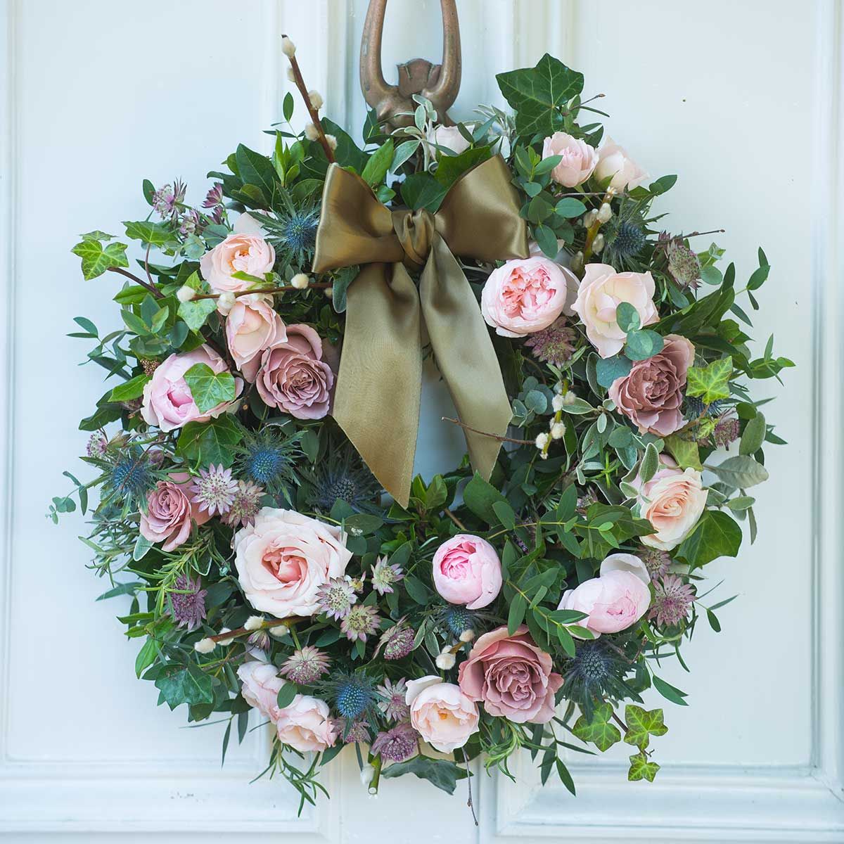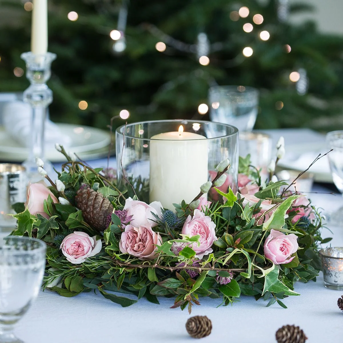

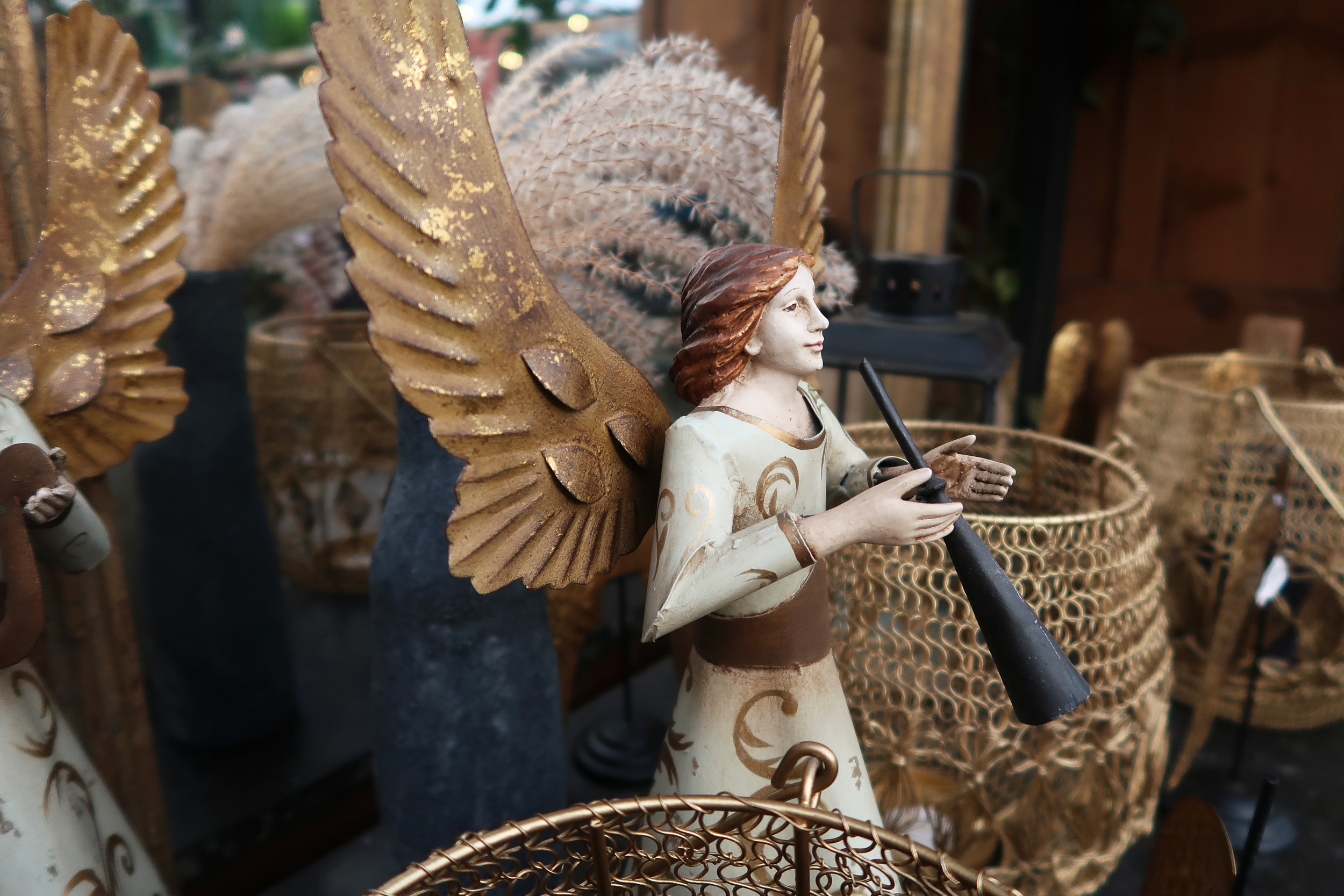
There’s still time to deck the halls, hang up the mistletoe and spruce up your home in time for Christmas. We went in search of some very stylish decorations to do just that. Here is our roundup of some of the best on offer which ramp up the glamour but without too much glitter.

Neptune
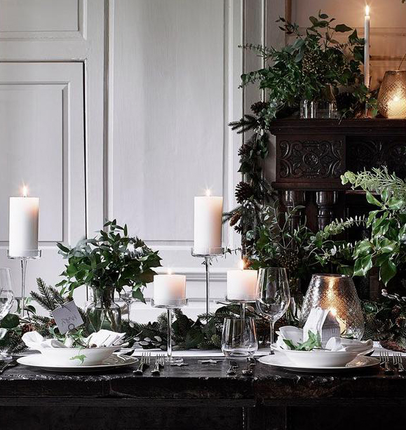
Neptune, whose furniture we featured in our previous Burne-Jones blog, do a gorgeous range of Christmas decorations which are available from their various stores and on-line… and also provide some brilliant festive inspo ideas to borrow.


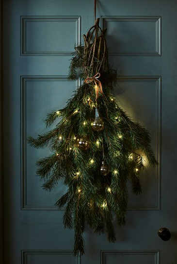


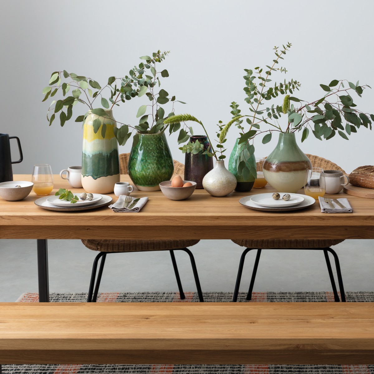
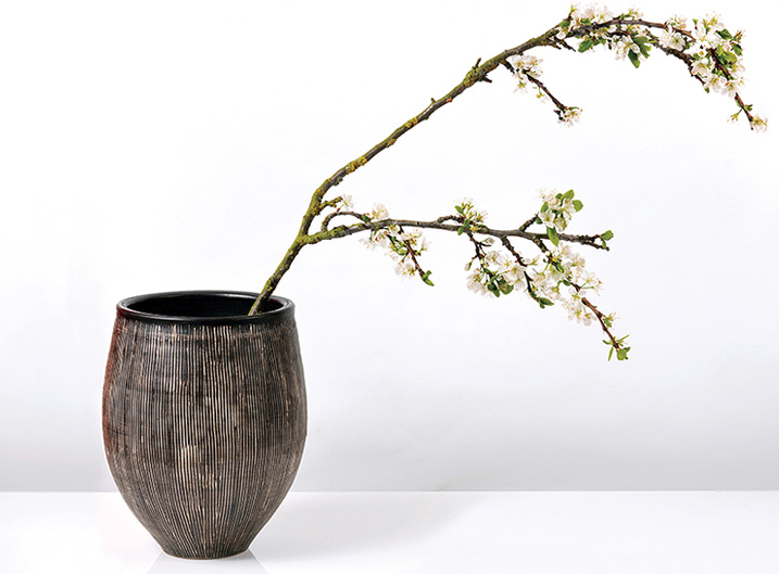
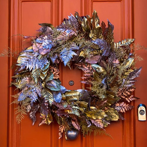
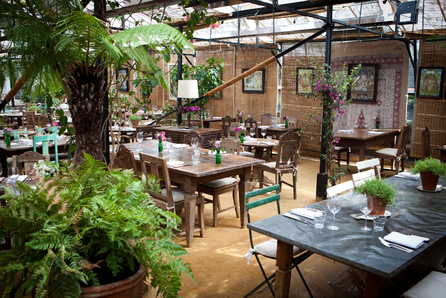
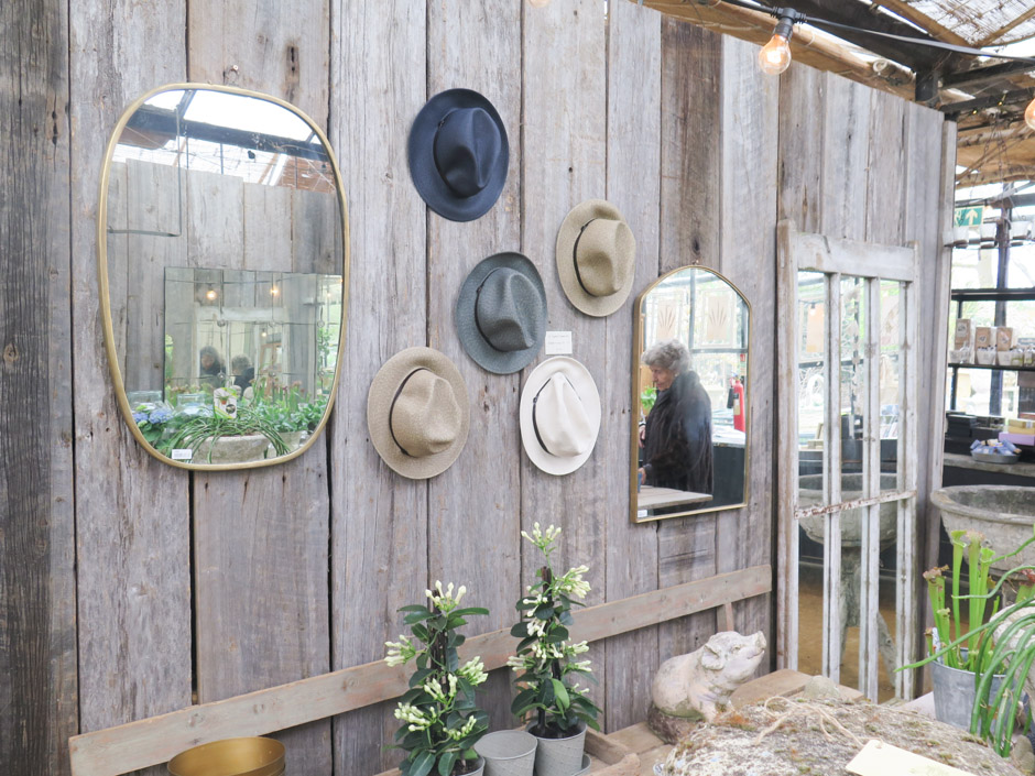
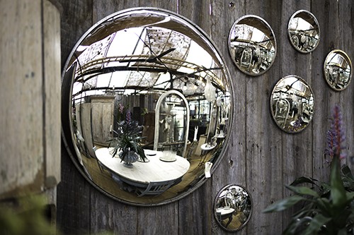
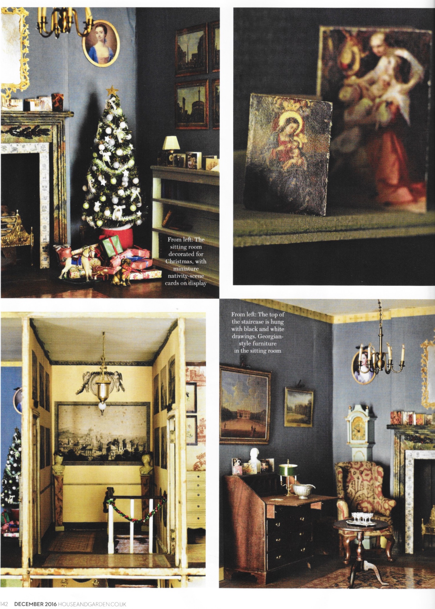
Petersham Nurseries in Richmond is another favourite and as always, have some great decorations and ideas for getting into the festive spirit.


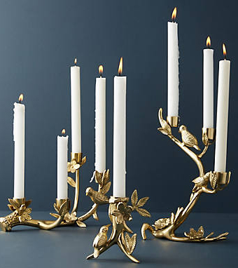
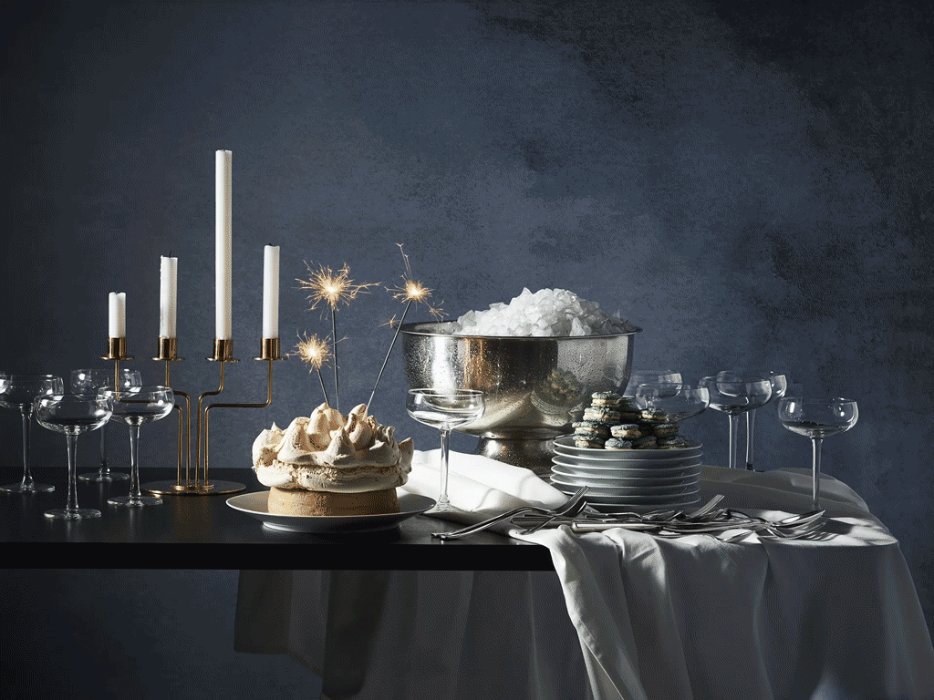
At Devas Designs, along with the sparkle and traditional colours of Christmas we also love to indulge in the all white themes conjured up by The White Company.


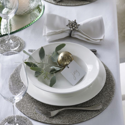
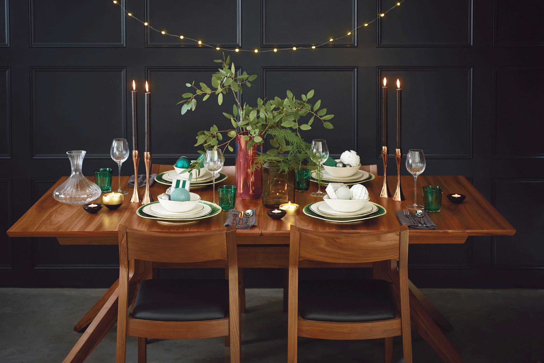
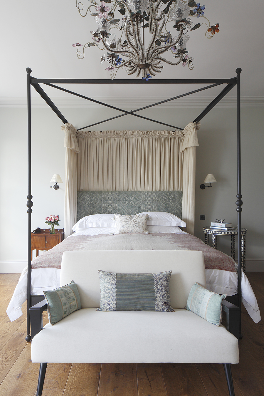
A very stylish Christmas from Devas Designs.

Petersham Nurseries