While it was hard to chose just a few, here is a selection of the pieces that were truly eye catching.
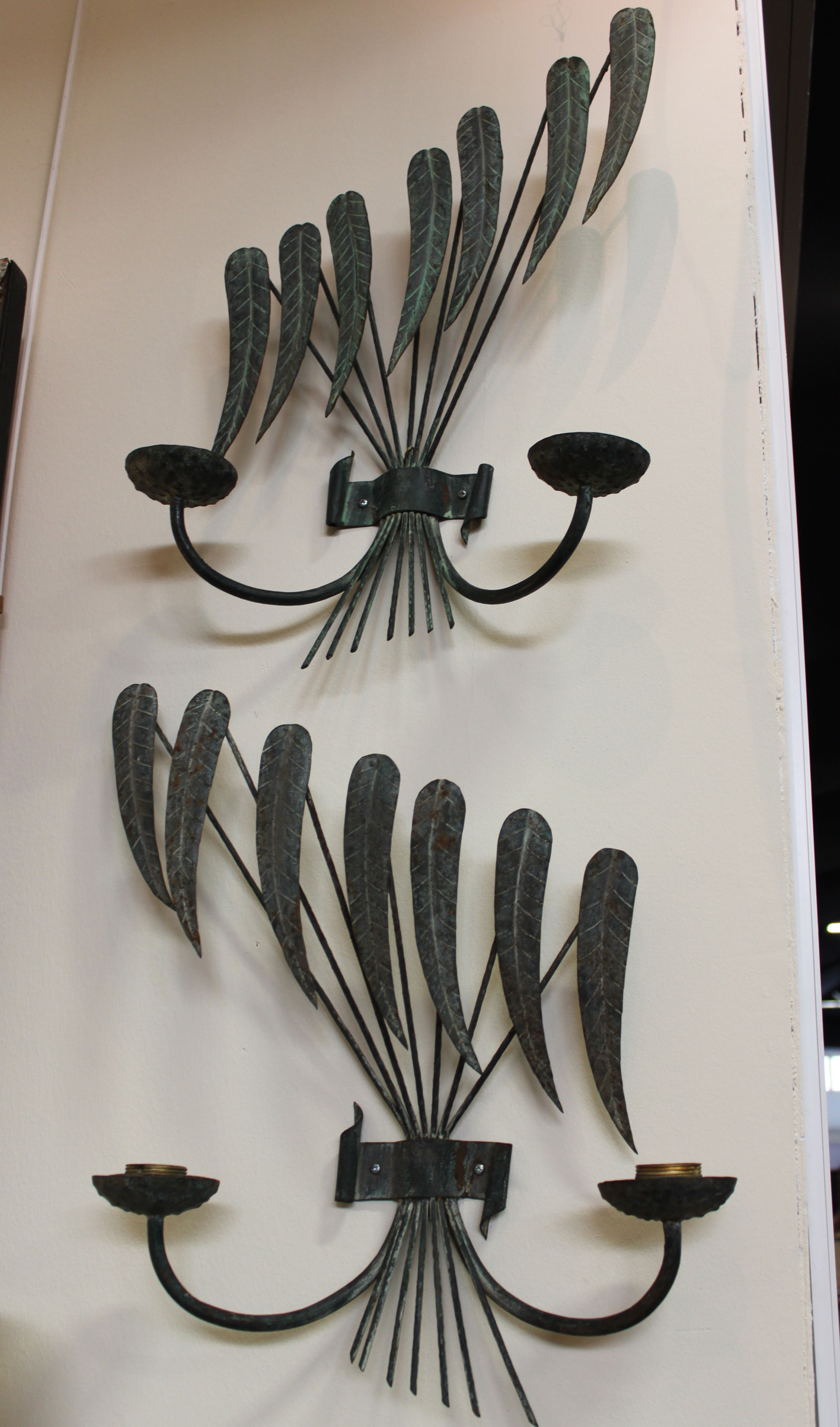
Among the wonderful lighting pieces on display was this piece by London based Dutch designer Tord Boontje. He is widely known for his famous Garland light that was a sell-out Habitat high street piece. As well as his belief in low-cost luxury and design, Tord wants to stress that modernism doesn’t always mean minimalism. His work blends traditional methods and design with contemporary technology to create sensory pieces. The ‘Ivy Shadow’ Chandelier on sale at Sotheby’s is made from laser cut aluminium and brass, then hand-painted in a ‘forest white’ finish. The details of this light has a beautiful fairytale like quality, while its pale colour and laser cut precision maintain a contemporary elegance.
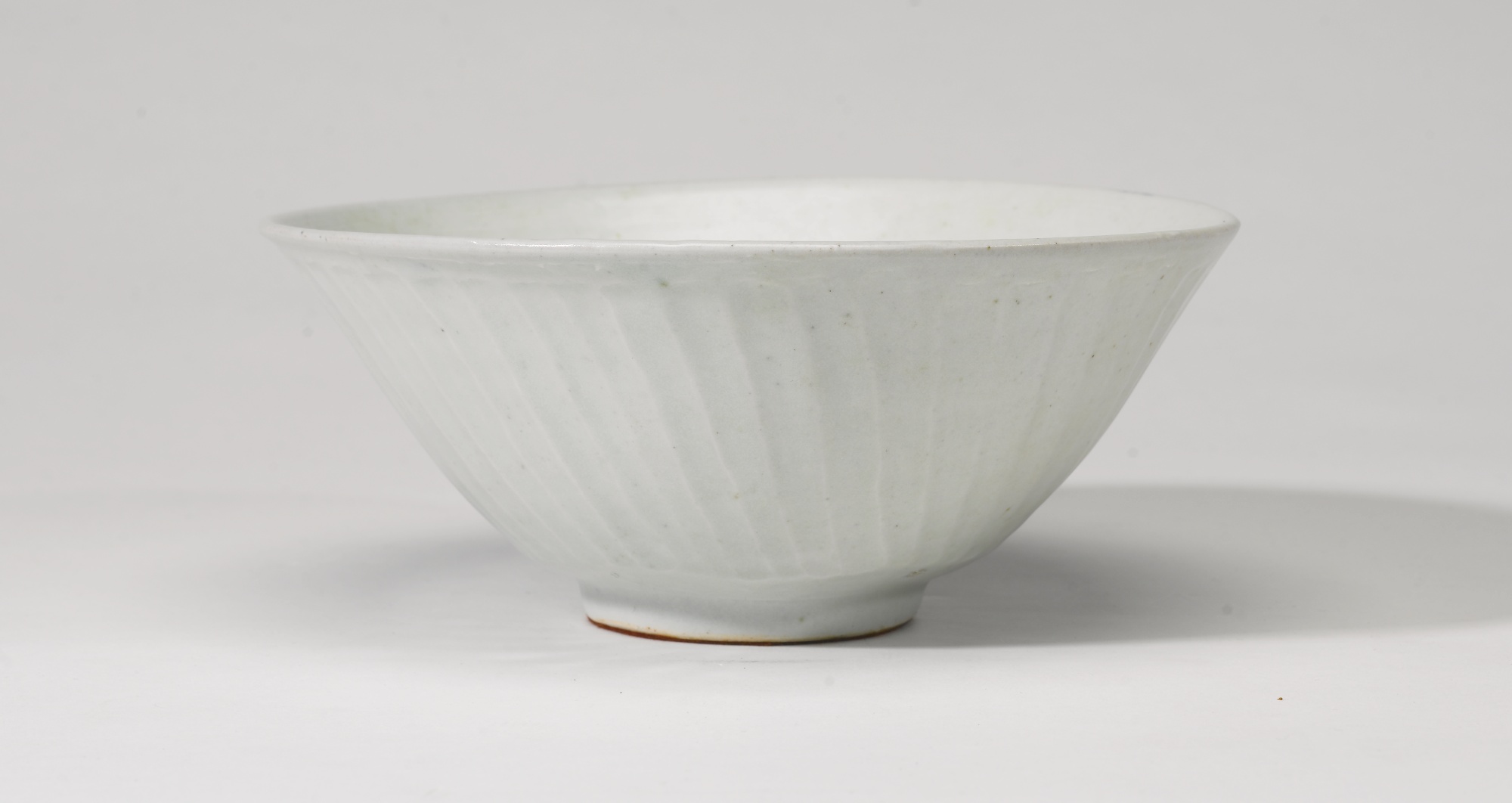
Alongside some extraordinary lighting designs are also a wonderful selection of ceramics. We’ve written about Lucie Rie’s work before, her ceramics and their subtle colouring really compliment a simple and modern interior. The bowl below is porcelain with a manganese glaze and inlay.
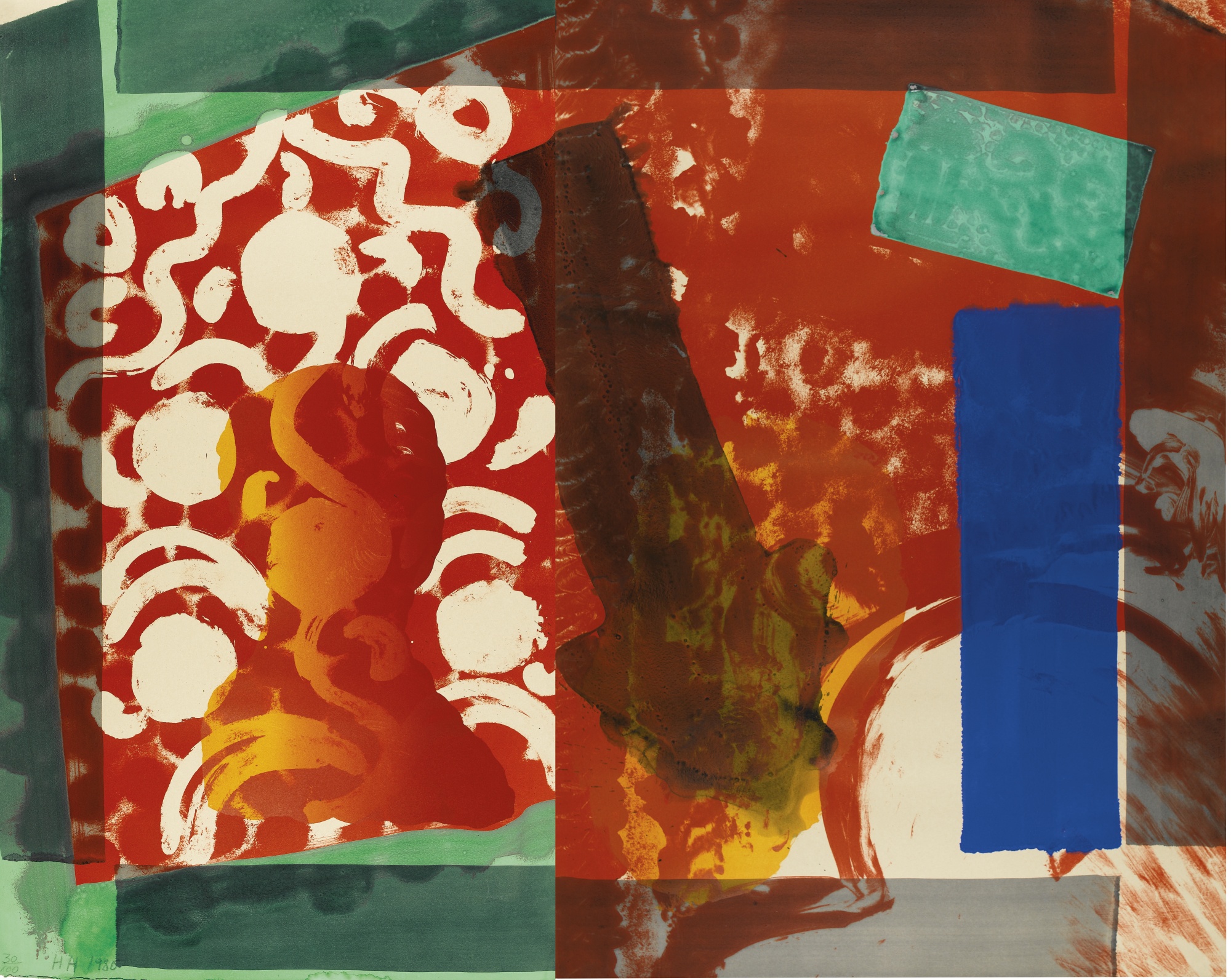
This rug made from hand flat-woven wool by Barbro Nilssen also caught our eye. Swedish designer Nilssen was inspired by nature, the sea and folk art for most of her designs. For past projects we have taken inspiration from rugs for a colour scheme. If you see an item like this that really appeals to you, think about using its colours and hues to inform the colours of your furnishings. Taking a subtle colour scheme like this rug below can help to create a harmonious balance in your interior.