Culture Trip: Barcelona

Travel remains a leading source of inspiration for Devas Designs and we are always excited to explore and discover cultural hotspots across the world. Recently one of our team visited Barcelona, a city bursting with colour and culture.

Here's a guide to our must-visit cultural sights in Barcelona:

1/ Museu Picasso

The Picasso Museum houses one of the most extensive collection’s of Picasso’s work with over 4,000 exhibited pieces. Comprising five medieval stone mansions, the museum is itself a beauty to behold with beautiful courtyards and winding staircases. Much of the collection focuses on Picasso’s formative years and the masterpieces he painted during his early teens - while not his most iconic works, they set him up as an artist of immense character and skill and it’s interesting to see his continual stylistic changes. A particular highlight was the room dedicated to his famous Blue period as well as a collection of Cubist paintings. A staggering collection in a stunning setting, one of our must-see Barcelona sights.

2/ Gaudi in Barcelona: Sagrada Familia, Park Guell and Casa Batllo

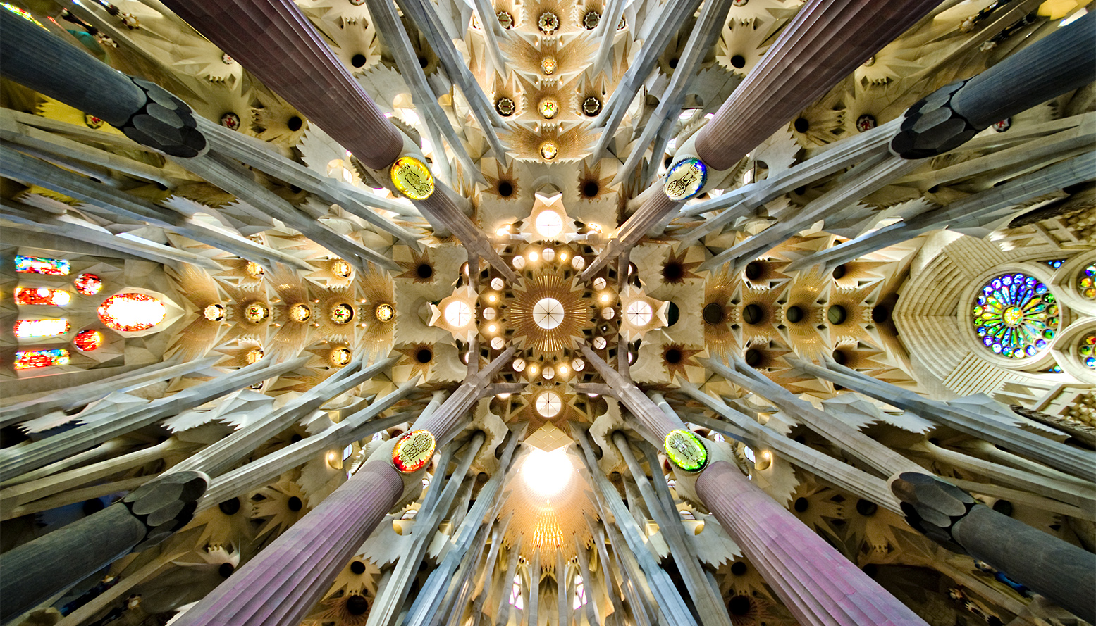
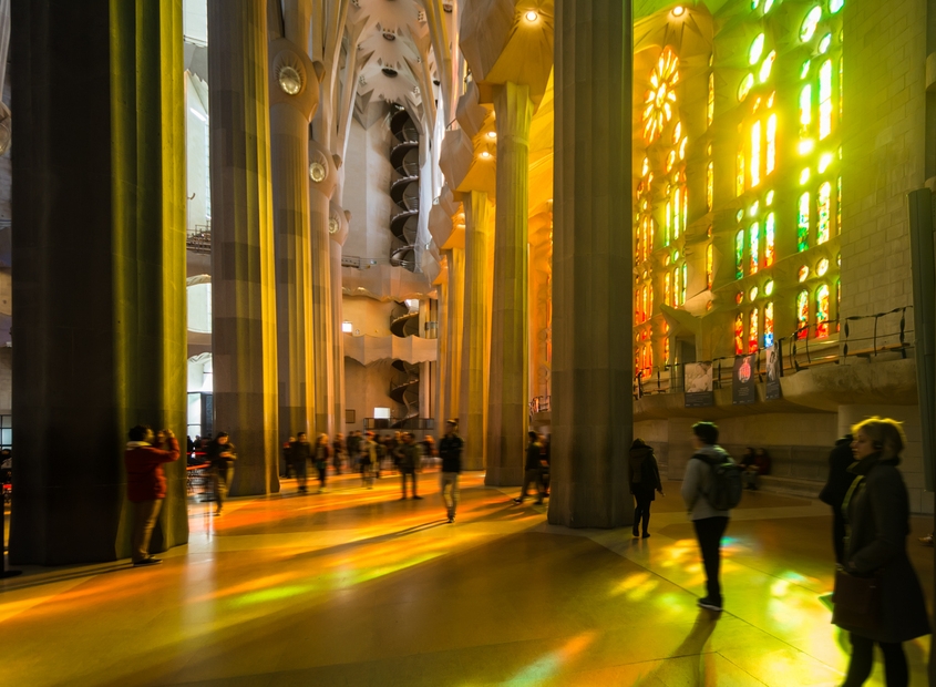
Sagrada Familia - It would be impossible not to mention Antoni Gaudi’s architectural masterpieces, his most distinctive creations are in Barcelona. The city’s shining glory is the Sagrada Familia, the giant basilica famously known for its continued construction which commenced in 1882. It’s a wild combination of Gothic and Art Nouveau forms and once inside, the stained glass windows cast a myriad of rainbow colours across the space.


Park Guell - Perhaps our favourite of Gaudi’s creations due to its natural outdoor elements. It sits on Carmel Hill with views across the city, and provides a beautiful interplay of natural forms and mosaic decorated structures. The main section is ticketed, but the beautiful gardens remain to free to visit, their tall trees provide calm and shade above the bustling hot city in the distance.

Casa Batllo - A smaller but no less impressive construction by Gaudi in the centre of Barcelona. It encapsulates Gaudi’s unique take on Art Nouveau design with its elaborate facade covered in broken mosaic tiles. The skeletal-like balcony details and curved patterned roof again call on organic forms and fluidity. Inside the tiled room and stained glass windows are just as beautiful and arresting as its exterior.

3/ Barcelona Museum of Contemporary Art (MACBA)

For those looking for a more contemporary experience, Barcelona’s Museum of Contemporary Art, aka MACBA, is the place to go. MACBA’s collection dates from mid-20th Century to the present day and is known for its hard-hitting modern displays - when we visited there was a riotous exhibition about the influence of Punk on modern art.

Matisse: Drawing with Scissors

Today’s blog is inspired by the work of Matisse and the touring exhibition ‘Matisse: Drawing with Scissors’ which is currently on display at the London Print Studio until June 11th.

The exhibition lithographic showcases prints of Matisse’s famous cut-outs which he produced in the last years of his life. He produced these works in his eighties, using paper that had been hand-painted with gouache, cut out then laid back down in abstract or figurative patterns. Matisse said ‘the paper cut-out allows me to draw in the colour… Instead of drawing the outline and putting the colour inside it… I draw straight into the colour’.

We also loved these images of Matisse’s studio in Nice c. 1952 and have been inspired by his bright and bold colours.

The exhibition is well worth a visit and we were inspired by the colours we saw to source a few items inspired by Matisse. Take a look at our picks below to find out how you can introduce some colour into your home, subtly, for the Summer months.

We found this beautiful removable wallpaper on Etsy by Kate Zaremba Company. Designer Kate Zaremba works as an illustrator and surface designer in Washington, she’s inspired by her childhood career in film and theatre as well as her trips to art galleries. We love the sense of play and creative imagination in her designs that comes from these influences. Take a look at the wallpapers below which have been inspired by Matisse’s cut-outs. Her wallpapers are self-adhesive, so easy to apply and remove. This is great if you’re looking to add some Summer colour and brighten up a room temporarily! 

The cushion below comes from Coverture & The Garbstore, who have a lovely shop in Notting Hill. They chose not to stock big brands and instead focus on independent and unique labels. This cotton cushion with a Matisse inspired print is designer by Bobo Choses and would add instant creative colour to your sofa or bed. They’ve also designed this fun beach towel, shown bottom right, if you fancy taking something colourful on your travels this Summer!

Hilma af Klint: Painting the Unseen at The Serpentine Gallery

This weekend we visited an extraordinary exhibition at The Serpentine Gallery of a Swedish artist Hilma af Klint. While this exhibition has attracted a huge amount of press, prior to this show she was virtually unknown in the UK.

Being a woman, producing pioneering and unconventional artwork such as this, is probably the greatest reason for af Klint's exception from history. She began her career by painting landscapes and portraits and gained some recognition at that time. It was her protestant upbringing and studies of Theosophy however that was the pivotal inspiration for her abstract works - this was also the first religious group in Europe to accept women in senior positions which must have empowered af Klint herself. Between 1906-07 she created her most revolutionary paintings which derived from automatic drawings she produced during seances - some encompass swirling abstract patterns, others follow geometric structured diagrams.

She painted the work below in 1907, years before Kandinsky or Mondrian or Malevich had ventured into abstraction. Looking into her colourful swirls, bold splatters and geometric shapes painted in the early 1900s it is undeniable that af Klint is a true pioneer of abstraction. 

Hilma af Klint was certainly a complex and creative character, drawing on spiritual experiences and unconscious thoughts. This is an unmissable exhibition and an important step in making sure that she gains recognition - open until May 15th 2016.

Flower Power

For this week’s blog we were inspired by a recent article about contemporary art and floristry. This floral art sees artists working with flowers to create incredible, blossoming structures that blur the boundary between floristry and sculpture. Often vast in form, utilising this natural, delicate material creates a truly poetic balance.

Daniel Ost is perhaps the best known floral artist. He has been creating floral art for over forty years and continues to mould his craft to suit contemporary trends. His current work integrates elements of contemporary design, with custom built structures that allow flowers to be weaved, hung or displayed around.

We were struck by this orchid canopy structure, pictured below, which integrates both contemporary design and natural orchids.

Another inspiring floral artist is East London based Rebecca Louise Law. She trained in Fine Art but her interests in nature preservation led to create floral installations. Speaking about her work she says that the ‘physicality and sensuality of the site specific work plays with the relationship between man and nature’. She transforms public spaces bringing in her floral creations to create a stunning display of dazzling natural beauty.

Alexander Calder: Performing Sculpture at Tate Modern

This week we visited the must-see new exhibition at Tate Modern, ‘Alexander Calder: Performing Sculpture’. It’s a truly beautiful and poetic exhibition showcasing Calder’s stunning kinetic sculptures.

Calder initially trained as an engineer before moving to Paris in the 1920s to start his artistic career. It was during his engineering education that he became fascinated with kinetics, physics and the nature of materials. In Paris he experimented with kinetic sculptures that brought to life the avant-garde interest in movement. His kinetic works blended movement with sculpture and in 1931 he invented the ‘mobile’ - Duchamp coined the term, having used it to describe Calder’s new sculptures. The poetry and beauty of his sculptures lay in their ability to move of their accord, simply catching the air in the space they hang.


We love pinning inspirational photos on Pinterest and Tate’s Pinterest board is always packed with great images. Their recent board ‘Art, Architecture and the Home’ show artworks in interiors, we liked this image below of Peggy Guggenheim alongside a Calder mobile - https://uk.pinterest.com/tategallery/art-architecture-and-the-home/

We also discovered this image of an Alexander Calder mobile in Georgia O’Keeffe’s house in Abiquiu, New Mexico. The blend of rustic design with the fluidity of his mobile is a perfect balance.

On the subject of artists’s home we were intrigued to find these images of Alexander Calder’s own living room. Having seen his mobiles in a white walled gallery space, it was quite the contrast seeing images of them amongst his colourful furnishings and belongings.

Scottish Art at Sotheby's

This month Sotheby’s launched a dedicated Scottish art sale. ‘Highlights of Scottish Art’ features eighty works by Scottish artists from the 19th and 20th centuries, including photography.

The work of renowned Scottish colourist Francis Campbell Boileau Cadell is headlining the auction. His works for sale included this piece ‘The Cheval Glass’ from his much loved Reflections series. We love this series particularly as each work shows a subject in an elegant and stylish interior. Each subject stands before a mirror and their reflection completes the portrait.

This work, also by Francis Campbell Boileau Cadell is beautifully vibrant. It depicts Florian’s Cafe in Venice and was strongly influenced by French impressionist painters like Cezanne. Cadell’s loose brushstrokes and free handling of paint give this painting a wonderful sense of energy. A work like this could perfectly enliven an interior and look dashing in a room with a neutral colour scheme.

There were also some charming works for sale by Samuel John Peploe who experimented with manipulating colour and form. He loved using strong colours and even used gesso to prime his canvas so that his colours were as vibrant as he could get them. 

William Russell Flint is particularly known for his watercolours, so this work really stood out for us. He trained as a lithographer and was a prolific book illustrator. We loved the blue, green and grey tones of this watercolour, it would lovely in a classic interior of a similar colour scheme. This work has a romantic and wistful atmosphere that is beautify elegant, a sense of stillness pervades. A work with a subtle atmosphere and tone like this can perfectly blend into an interior, bringing a splash of colour and elegance without detracting from interior design and existing architectural details.

'Picasso Sculpture' at MoMA New York

You might have seen from Philippa’s Twitter photos that she spent last week in New York, exploring the city and in particular its extraordinary art galleries. New York during the Autumn is a beautiful place, its colours and culture are truly inspiring.

For those of you who have been, it will be no surprise that one of our highlights was visiting MoMA. We were lucky enough to catch MoMA’s exhibition of Picasso’s sculptures. It’s been highly anticipated as there hasn’t been an exhibition of this scale of Picasso’s sculptural works since 1967.

 Throughout his influential career, sculpture was a medium Picasso returned to time and again. He approached sculpture in an excitedly experimental way which we love. He blended both traditional and unconventional materials and methods, much like his paintings.

The exhibition itself had over one hundred works on display, complimented by photographs and works on paper which was a lovely story telling device.

Picasso’s ‘Still Life with Guitar’ (1912) really grabbed our attention. It has been formed in true Cubist style, with multiple angles modelled from cardboard.

It was fascinating to see an artist whose career is triumphed though works on canvas with such a vast collection of sculptural works. We also enjoyed seeing how his sculpture informed his painted works and vice versa. 

Fabric Inspiration

For this week’s blog we want to focus on fabrics.

When we work on an interior design project, we often make use of beautifully printed or painted fabrics. Whether you are choosing fabrics for furniture and small furnishings or larger wall coverings, it is crucial that the colour and design tie in with the look and feel of your interior - if you’re completely drawn to a fabric it can even inspire your overall colour scheme.

Elizabeth Eakins set up her rug and textile business in 1978, with a focus on making by hand. All of her fabrics are made from natural fibers and include linen, hemp and wool blends. We were particularly drawn to this natural hemp linen fabric, ‘Esther Young’ in azure and rose.

We also loved this fabric from Harlequin’s collection. The fabric has been digitally printed for accuracy with botanical-style representations of hummingbirds in beautiful and crisp colours. The detail is exquisite and would add both a splash of colour and a real sense character to either a classic or contemporary interior.

Turnell and Gigon distribute beautiful fabrics which range from both classic and contemporary designs. We loved these deigns in cream and blue colours, the coloured detail looks beautiful over these subtle backgrounds. 

'Made in Britain' // Sotheby's

We had a difficult decision choosing just a few of our favourites, but take a look at some of our highlights and let us know what caught your eye!

Howard Hodgkin’s work always catches our eye for its expressive colouring. The work below, entitled Moonlight (1980) is a beautiful lithograph printed in colours with additional hand-colouring. Hodgkin is one of Britain’s most important printmakers and painters and his bold style is completely captivating. Since the 1970s expressive patterning has dominated his work, combining printmaking techniques, bold brushstrokes and bright daubs of paint to produce punchy abstract works that would instantly enliven a room.

There is a finely balanced tension that we find interesting in Victor Pasmore’s work; the balance of saturated colour and fine black strikes. We were drawn to this piece entitled Senza Titolo (1991) for its unified hue. A work like this can really inform a colour scheme if you are designing a new interior, or help to tie together an existing colour scheme. We are inspired by works of art and their expressive colours and often use them as starting points for a new project’s colour scheme.

There was also a fantastic selection of ceramics on sale. The four pouring vessels by Rupert Spira, below left, are beautifully elegant in their shape and blue glaze. We were also drawn to the ceramic pieces on sale by Lucie Rie. The footed bowl, below centre, has a beautiful matt blue glaze and bronzed rim. On sale were also ceramics from one of Britain’s most respected and influential potters, Bernard Leach. The fluted bowl, below right, is made from porcelain with a celadon glaze. Its size, form and neutral glaze give it a sense of timeless elegance that would sit beautifully in either a modern or classic home.

We were also struck by the painting on sale by Mary Fedden. Fedden’s work is characterised by her use of bold, often contrasting, expressive colours. The vivid colours in the painted still life, below, left, with reds, purples and greens would really bright a vibrant splash of colour to a neutral room. We often enjoy pairing vibrant works of art with interiors that have muted colour schemes, and tie it in with details like cushions that work with the colours.

With the Tate’s major retrospective on this month, we were also looking out for works by Barbara Hepworth. The lithograph printed in black and yellow, below left, is beautifully harmonious and would perfectly compliment an interior with a muted and subtle colour scheme. The screen print, below right, by Ben Nicholson has been printed on woven silk. The delicate quality of the material blends beautifully with his subtle and sensitive colour scheme. Whether your interior is modern or classic, works of art that are elegant and subtle like this piece can really add charm to your home.

London Design Festival 2015

We’ve loved seeing design installations popping up across London over the past week for this year’s London Design Festival. Its mission to pronounce London as the design capital is clear and compelling with so many hundreds of young and established designers proving their talent. There are some fantastic events taking place until the end of the month, so we’ve picked some of our must-see spots to make it easier for you.

First up is designjunction  from furniture to lighting to product design, designjunction is packed with inspiring designs. Staged in Victoria House and the old St Martins college building in Holborn, the designjunction flagship had a range of exhibitors showcasing cutting-edge brands, new labels and design pop-ups.

If you’re a Londoner reading this, you’ve probably already seen you twitter feed clogged up with photos of Charles Petillon’s Heartbeat installation in Covent Garden Market. Petillon has created a 54 metre stretch of white balloons with gently pulsating white lights to evoke a heartbeat. They appear almost cloudily and beautifully poetic.

Speaking of the work Petillon said: “The balloon invasions I create are metaphors. Their goal is to change the way in which we see the things we live alongside each day without really noticing them. With Heartbeat I wanted to represent the Market Building as the beating heart of this area – connecting its past with the present day to allow visitors to re-examine its role at the heart of London’s life.” The installation is completely free to walk around and up until September 27th.

Somerset House is also taking part this year, hosting a series of exhibitions and talks. Among them, one of our favourites is their 10 Designers in the West Wing exhibition. They’ve teamed up with the London Design Festival organisers to showcase 10 leading international designers including Nendo, Faye Toogood and Ross Lovegrove.

We particularly enjoyed Faye Toogood’s display of drawing rooms, redrafted as charcoal sketches on translucent plastic sheets that line the walls. She creates an atmospheric space to relax in.

There’s also a focus on new digital technology, with Tino Schaedler of Optimist Design joining with United Realities to take us on a journey in exploring both physical and virtual spaces and their connections. Free and open until September 27th, more info here.

Christie's Interiors August 2015

Christie’s South Kensington is celebrating its 40th year with talks and events. This week we attended the Christie’s Interiors August auction and a talk on The Art of Interior Design with some great speakers including James McWhirter and Sarah Morris of McWhirter Morris.

We visit as many art, antiques and designs fairs as we can and are always on the lookout for unique pieces. Here are some of our favourite pieces from Christie’s Interiors August auction – the auction is on August 18th so do pop along to take a look at what’s on sale.

Alongside items of furniture are a stunning selection of 20th and 21st Century paintings. The work of Polish painter Zdzislaw Ruszkowski (1907-1991) particularly caught our eye. During the 1930s Ruszowski moved to France where he discovered the work of Cezanne and was hugely inspired by his colouring and Post-Impressionistic approach. There is a beautiful and sensitive lyricism in Ruszowski’s work, aided by his playful yet harmonious colour schemes.

We were also intrigued by these coloured chalk drawings by John Golding. The colour scheme, with subtle hints and richer tones could provide the perfect inspiration for an interior’s colour scheme. This is a great example of how one piece, like a work of art, can really influence and dictate your interior design choices.


Clerkenwell Design Week 2015 Showrooms

As well as the myriad of pop-up design stands and exhibits at Clerkenwell Design Week 2015, Clerkenwell is known for its impressive array of design showrooms. We visited a few of our favourites that were open during CDW.

West One Bathrooms always intrigues us for their display of both classic and often surprising bathroom designs. One of the ranges that caught our eye was the Vir Stil collection (below left) for Kallista designed by New York designer Laura Kirar. Kirar’s collection was inspired by different design periods including Danish Modern and traditional Japanese forms. From these inspirations she’s created an elegant collection that retains a classic sense of refinement together with subtle modern touches and materials. The console top comes in Calacatta Borghini marble with finishes in bronze, chrome or nickel. 

We also took a look at bulthaup’s showroom, which never fails to impress for its focus on perfect design and innovative kitchen solutions combined with a real sensitivity for the existing architecture of a building. We really liked the bulthaup b2 kitchen workshop (below) which really is designed to be functional and spatially economical.

We were also intrigued to see their arrangements of vintage tools and furnishings. In line with the young designers from our previous blog post, bulthaup also seems to be harking back and drawing influence from classic and older design sources.

Havwoods certainly went for a standout display method, their collection of exquisite wood floors was showcased atop an old fashioned Routemaster bus. Havwoods flooring can really transform a room, their exquisite quality and range of finishes would suit both a classic and modern interior.

Clerkenwell Design Week 2015

Clerkenwell Design Week was a truly inspirational festival, a real celebration of craft and design. CDW2015 showcased both established and emerging designers and companies. There was a really refreshing variety of work, but what we were most struck by was the shared sense of nostalgia. There seemed to be a focus on looking back to historic design movements for inspiration as well as keeping craft alive.

This Robin Day chair (below left) caught our eye as soon as we walked in. Day undoubtedly transformed British design and high street furniture, his 'Polyprop' stacking chairs has become one of the best selling chairs of all time. It was his postwar modernist furniture though that has been so influential to contemporary design as he developed low-cost but sensitively designed items.

His influence was evident in Stellar Works 'Utility' range (below right) which centres on this idea of function and efficiency. Their return to industrial design is counterbalanced by their use of soft leather and smooth woods.

Stellar Works Laval desk (below left) is a collaboration between French furniture maker Laval and Danish design studio OeO. The collection aims to merge a sense of French elegance and simplicity with a more modern need for comfort and utility.

Tomas Alonso’s Offset Table (below right) designed for Maxdesign responds to the need for flexibility in modern working home offices. The table can be broken down and customized for varying lighting, cable and size requirements. Alonso describes it as ‘a place to eat, a place to work and a place to meet all at the same table’.

It was great to meet the team at James UK as we really value their emphasis on British craft. All of their furniture is made in the UK by a team of skilled carpenters and upholsterers. The Norton Cove sofa (below left) is a larger take on the typical armchair.

Furniture brand H were inspired by a belt-making loom found in Oaxaca, Mexico for their Loom chair (below right). They've been collaborating with a textile designer whose colour choices perfectly balance with the hardwood frame.

Thonet's iconic range has been updated to suit contemporary interiors. Their display focussed on their design history showing the evolution of Thonet’s curved wooden designs to Marcel Breuer’s curved tubular steel designs.

Springtime Inspiration

Spring is the time of plans and projects

- Leo Tolstoy -

With Spring in the air we wanted to share an insider peak into a Devas Designs' project in London. The upstairs drawing room is centred around a colour palette of pastel blues, greens and greys … the perfect colours for a Springtime mood board. 

For this room’s colour scheme Philippa took inspiration from this unusually pale coloured Ziegler carpet. Its pastel tones with hints of earthy red and green instantly caught Philippa’s eye.  With these colours in mind we chose an eclectic selection of cushions that each have their own character whilst following these same colours.

The two terrace windows provide a beautiful, fresh light throughout the day, which perfectly harmonises with the pastel tones. We kept the curtains simple, choosing white linen to maximise the light. The walls were painted with an off-white so that the light softly reflected back onto itself.

Devas Designs loves incorporating antique pieces into modern interiors, especially when they tie in with the colour palette. This green decorated jug is an antique Staffordshire piece. The sea shelled table top was initially a single frame artwork which was later turned into this table.

The room also features several paintings including works by Tim Woolcock and Edward Seago.