Botticelli Reimagined

For this week’s art fix we visited the V&A’s hotly anticipated ‘Botticelli Reimagined’ exhibition.

The V&A reminds us that his Botticelli’s work was largely forgotten for 300 years before audiences rediscovered it in the 19th Century. Since then he has informed the work and imagery of artists to come.

What makes this exhibition so remarkable initially, is its sheer quantity of work, from painting to fashion to film and photography to sculpture and tapestry - it’s got it all! There are some truly breathtaking works like Rosetti's La Ghirlandata, pictured below left. Rosetti even owned work by Botticelli, one of which is featured in this exhibition, a true testament of his love of the Renaissance master.

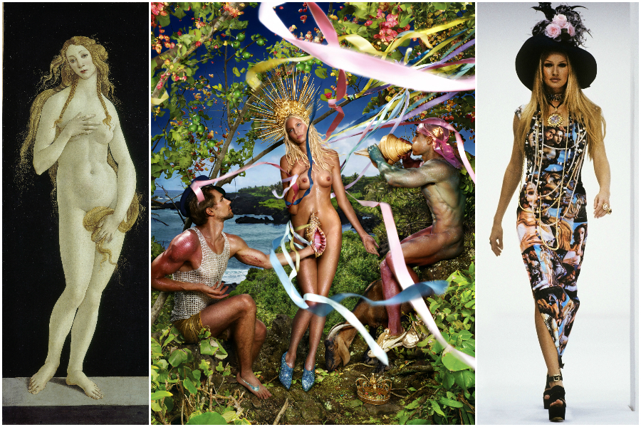
While we loved seeing the traditional works on display, one of the highlights for us was seeing the contemporary piece and how Botticelli’s Venus has been subverted in contemporary art. The photograph in the centre below uses pieces of trash and junk, remoulding it into Botticelli's iconic composition. The beauty of the images lies in Botticelli's Venus icon to survive amongst its mishmashed context - an interesting metaphor for its endurance in contemporary culture.

Hilma af Klint: Painting the Unseen at The Serpentine Gallery

This weekend we visited an extraordinary exhibition at The Serpentine Gallery of a Swedish artist Hilma af Klint. While this exhibition has attracted a huge amount of press, prior to this show she was virtually unknown in the UK.

Being a woman, producing pioneering and unconventional artwork such as this, is probably the greatest reason for af Klint's exception from history. She began her career by painting landscapes and portraits and gained some recognition at that time. It was her protestant upbringing and studies of Theosophy however that was the pivotal inspiration for her abstract works - this was also the first religious group in Europe to accept women in senior positions which must have empowered af Klint herself. Between 1906-07 she created her most revolutionary paintings which derived from automatic drawings she produced during seances - some encompass swirling abstract patterns, others follow geometric structured diagrams.

She painted the work below in 1907, years before Kandinsky or Mondrian or Malevich had ventured into abstraction. Looking into her colourful swirls, bold splatters and geometric shapes painted in the early 1900s it is undeniable that af Klint is a true pioneer of abstraction. 

Hilma af Klint was certainly a complex and creative character, drawing on spiritual experiences and unconscious thoughts. This is an unmissable exhibition and an important step in making sure that she gains recognition - open until May 15th 2016.

Painting the Modern Garden: Monet to Matisse at The Royal Academy of Arts

We visited ‘Painting The Modern Garden’ … While Monet is at the centre of this exhibition, there are works by Renoir, Cezanne, Pissarro, Van Gogh, Matisse and Klimt to name a few. The exhibition promises to help you see ‘the garden in art with fresh eyes’ and its doesn’t disappoint.

Interestingly the natural garden subject seems to have enabled many of these avant-garde artists to work with a greater freedom than before, freeing their palettes and their brushstrokes. Throughout he exhibition you are greeted with Monet’s stunning gardens until ending in a grand finale; Monet’s great pastel coloured waterlily paintings.

The exhibition opens with a beautiful comparison - Monet's 'The Artist's Garden in Argenteuil' (pictured below left) is placed beside Renoir's painting of Monet painting in the very garden in Argenteuil (pictured below right). This sets the tone for the exhibition, an affirmative statement about the impact Monet had on his fellow impressionists and hints that he influenced not only the garden subject matter but the act of painting en plein air.  

There are some beautiful works by a less famous name, Spanish artist Santiago Rusinol. His paintings are more structured than the Impressionist works on display and convey spectacular modelling of light, like this work below which evokes the brilliant glow of sunset. 

We thought it would be lovely to also share with you some images of Monet's garden in Giverny. These are the gardens Monet spent nearly forty years in his house in Giverny, a period many argue were his most creative. In 1883 he and his family rented the house with its 2 acre land and by 1890 he had saved enough to buy it and the surrounding land. As an avid gardener himself, Monet worked alongside his gardeners and created precise designs and layouts for his garden's planting, resulting in a stunning display. Over time he built up the land, eventually buying a water meadow which he plated up with water lilies. These became the subject of his best known works and the water meadow is now one the garden's most popular features. 

Flower Power

For this week’s blog we were inspired by a recent article about contemporary art and floristry. This floral art sees artists working with flowers to create incredible, blossoming structures that blur the boundary between floristry and sculpture. Often vast in form, utilising this natural, delicate material creates a truly poetic balance.

Daniel Ost is perhaps the best known floral artist. He has been creating floral art for over forty years and continues to mould his craft to suit contemporary trends. His current work integrates elements of contemporary design, with custom built structures that allow flowers to be weaved, hung or displayed around.

We were struck by this orchid canopy structure, pictured below, which integrates both contemporary design and natural orchids.

Another inspiring floral artist is East London based Rebecca Louise Law. She trained in Fine Art but her interests in nature preservation led to create floral installations. Speaking about her work she says that the ‘physicality and sensuality of the site specific work plays with the relationship between man and nature’. She transforms public spaces bringing in her floral creations to create a stunning display of dazzling natural beauty.

William Morris Gallery

Last weekend we visited the beautiful William Morris Gallery in London. William Morris is perhaps the best known proponent of the British Arts and Crafts Movement. His contribution is particularly marked with the revival of traditional textile arts.

Alongside his textile design, he was also a poet, novelist and social activist. The Arts and Crafts Movement developed in the 19th Century as a result of artists concerns over industrialisation. The Movement placed value on materials and design, advocating art reform.

The gallery is situated in a Grade II listed Georgian house, itself a lovely building. The Walthamstow house was William Morris’s family home between 1848-1856 - he would have been only six when he moved in. Walthamstow was at that time a country village and many have suggested that Morris was later influenced by his time spent there, surrounded by natural forms. Going against industrialisation, Morris’s designs are rooted in nature, drawing inspiration directly from natural forms including flowers, leaves and branches.


For Interior Designers, the Arts and Crafts Movement can be particularly influential as its designs featured throughout household items from wallpaper to furniture and the architecture itself.

The London Art Fair 2016

As you know, the team here at Devas Designs love making sure we keep up with London’s latest arts and antiques fairs and exhibitions. We source a variety of items for clients from works of contemporary art to antique treasures, either as part of a project or as a one off. We are therefore always on the look out for exceptional pieces for our clients and make sure we keep track of the latest trends in the market.

This week we visited The London Art Fair held at the Business Design Centre in Islington. Split into various sections, the fair had a wide and electric selection on display including both young, emerging artists and established big names like Damien Hirst.

One of our favourite displays was the ‘Coast’ exhibition curated by the highly regarded Jerwood Gallery. They were displaying key works from their Jerwood Collection which included some of our favourite British artists such as Barbara Hepworth, John Piper and Ben Nicholson. Although we source international work and have a diverse knowledge of international art, we enjoy being able to collect British works for our clients. Often these works of art sit beautifully in British homes as they can reflect their landscape.

The works on display at ‘Coast’ all displayed how the British Coastline has influenced a selection of British artists - it reminded us of our past interior design project on the Irish West Coast, we took inspiration from the colours and atmosphere of its surrounding and focussed on a palette of pale greens, pale blues and greys. You can read more and see photographs of this project by clicking here.


PAD London Art & Design Fair

Last week we visited PAD London Art and Design fair in London…

If you’re interested in buying modern art or design pieces for your home we always recommend visiting renowned fairs like PAD. If you’re unsure on what to chose, make sure you get talking to the exhibitors as they’re always on hand to answer questions and help you find pieces that work for your home. We also recommend taking photos of pieces that catch your eye and think about them when you return home.

We wanted to share some of the exhibitors and pieces that interested us, here's our favourites  …

Chahan Minassian brought some exquisite pieces over from his showroom in Paris. Chahan works as a designer, interior designer, antique dealer and gallery director so his eye for elegantly designed pieces is finely tuned. Inspired by luxury materials like bronze, lacquer and tortoiseshell, Chahan has designed his own line of furniture and lamps.

The simplicity of his designs combined with the luxury of materials gives his pieces an elegant timelessness that could work in both modern and classic interiors.

We were also taken by the pieces on sale from Magen H Gallery who were over from New York. They specialise in French post-war designers with an emphasis on craft mediums that merge art and design.

Their display included this dining table, below, by Sido and Francois Thevenin from 1970. The French husband and wife design team worked together labouring intensely over hand-forged pieces from wood and metal. 

Another exhibitor over from Paris was Jacques Hervouet who runs a gallery in Paris and custom designs furniture and accessories. For his custom pieces he enjoys mixing eras and blends both historic and contemporary designs, creating a style he calls ‘Radical Chic’. There is confidence and boldness that pervades both his collections and custom pieces which we love.


'Made in Britain' // Sotheby's

We had a difficult decision choosing just a few of our favourites, but take a look at some of our highlights and let us know what caught your eye!

Howard Hodgkin’s work always catches our eye for its expressive colouring. The work below, entitled Moonlight (1980) is a beautiful lithograph printed in colours with additional hand-colouring. Hodgkin is one of Britain’s most important printmakers and painters and his bold style is completely captivating. Since the 1970s expressive patterning has dominated his work, combining printmaking techniques, bold brushstrokes and bright daubs of paint to produce punchy abstract works that would instantly enliven a room.

There is a finely balanced tension that we find interesting in Victor Pasmore’s work; the balance of saturated colour and fine black strikes. We were drawn to this piece entitled Senza Titolo (1991) for its unified hue. A work like this can really inform a colour scheme if you are designing a new interior, or help to tie together an existing colour scheme. We are inspired by works of art and their expressive colours and often use them as starting points for a new project’s colour scheme.

There was also a fantastic selection of ceramics on sale. The four pouring vessels by Rupert Spira, below left, are beautifully elegant in their shape and blue glaze. We were also drawn to the ceramic pieces on sale by Lucie Rie. The footed bowl, below centre, has a beautiful matt blue glaze and bronzed rim. On sale were also ceramics from one of Britain’s most respected and influential potters, Bernard Leach. The fluted bowl, below right, is made from porcelain with a celadon glaze. Its size, form and neutral glaze give it a sense of timeless elegance that would sit beautifully in either a modern or classic home.

We were also struck by the painting on sale by Mary Fedden. Fedden’s work is characterised by her use of bold, often contrasting, expressive colours. The vivid colours in the painted still life, below, left, with reds, purples and greens would really bright a vibrant splash of colour to a neutral room. We often enjoy pairing vibrant works of art with interiors that have muted colour schemes, and tie it in with details like cushions that work with the colours.

With the Tate’s major retrospective on this month, we were also looking out for works by Barbara Hepworth. The lithograph printed in black and yellow, below left, is beautifully harmonious and would perfectly compliment an interior with a muted and subtle colour scheme. The screen print, below right, by Ben Nicholson has been printed on woven silk. The delicate quality of the material blends beautifully with his subtle and sensitive colour scheme. Whether your interior is modern or classic, works of art that are elegant and subtle like this piece can really add charm to your home.

London Design Festival 2015

We’ve loved seeing design installations popping up across London over the past week for this year’s London Design Festival. Its mission to pronounce London as the design capital is clear and compelling with so many hundreds of young and established designers proving their talent. There are some fantastic events taking place until the end of the month, so we’ve picked some of our must-see spots to make it easier for you.

First up is designjunction  from furniture to lighting to product design, designjunction is packed with inspiring designs. Staged in Victoria House and the old St Martins college building in Holborn, the designjunction flagship had a range of exhibitors showcasing cutting-edge brands, new labels and design pop-ups.

If you’re a Londoner reading this, you’ve probably already seen you twitter feed clogged up with photos of Charles Petillon’s Heartbeat installation in Covent Garden Market. Petillon has created a 54 metre stretch of white balloons with gently pulsating white lights to evoke a heartbeat. They appear almost cloudily and beautifully poetic.

Speaking of the work Petillon said: “The balloon invasions I create are metaphors. Their goal is to change the way in which we see the things we live alongside each day without really noticing them. With Heartbeat I wanted to represent the Market Building as the beating heart of this area – connecting its past with the present day to allow visitors to re-examine its role at the heart of London’s life.” The installation is completely free to walk around and up until September 27th.

Somerset House is also taking part this year, hosting a series of exhibitions and talks. Among them, one of our favourites is their 10 Designers in the West Wing exhibition. They’ve teamed up with the London Design Festival organisers to showcase 10 leading international designers including Nendo, Faye Toogood and Ross Lovegrove.

We particularly enjoyed Faye Toogood’s display of drawing rooms, redrafted as charcoal sketches on translucent plastic sheets that line the walls. She creates an atmospheric space to relax in.

There’s also a focus on new digital technology, with Tino Schaedler of Optimist Design joining with United Realities to take us on a journey in exploring both physical and virtual spaces and their connections. Free and open until September 27th, more info here.

Inspired by Works of Art - Agnes Martin and Sonia Delaunay

We’ve been struck by two recent exhibitions at Tate Modern this month – Agnes Martin and Sonia Delaunay. While their work is clearly aesthetically different, they are united in their focus on colour, tone and pattern.

Agnes Martin’s work sits within a tuning point between Abstract Expressionism and Minimalism. While living in Lower Manhattan she met the bright young artists of the 60s like Jasper Johns, Ellsworth Kelly and Robert Rauschenberg – they inspired her to start incorporating found objects to create assemblages.

She eventually turned to a more minimal approach, often using grid-like structures. We were struck by her subtly striped paintings, from a distance some appear almost monochrome but when viewed closer become alternating stripes of pastel tones. These muted tones are also very on trend – Tate has even created their own Pinterest board with interiors that follow an Agnes Martin inspired colour schemes!

Take a look here

Sonia Delaunay is well known for her exploration of dynamic contrasting colours and compositions, pioneering the movement ‘Simultaneism’ with her husband Robert Delaunay.

Delaunay was a key figure in the avant-garde movement in Paris and as well as fine art, she produced dresses, scarves, umbrellas, hats, shoes and swimming costumes. She also created some iconic and stunning carpet designs, seen below. Her focus on colour and harmony makes her a perfect artist for inspiration, whether you’re looking for a new bold colour scheme or to add splashes of colour into your interior, her confident colours would certainly stand out.

Her and Robert were influence by the strong colours of Fauvist artists and they tried to use these colours in their own work, with a greater focus on rhythm.

Christie's Interiors August 2015

Christie’s South Kensington is celebrating its 40th year with talks and events. This week we attended the Christie’s Interiors August auction and a talk on The Art of Interior Design with some great speakers including James McWhirter and Sarah Morris of McWhirter Morris.

We visit as many art, antiques and designs fairs as we can and are always on the lookout for unique pieces. Here are some of our favourite pieces from Christie’s Interiors August auction – the auction is on August 18th so do pop along to take a look at what’s on sale.

Alongside items of furniture are a stunning selection of 20th and 21st Century paintings. The work of Polish painter Zdzislaw Ruszkowski (1907-1991) particularly caught our eye. During the 1930s Ruszowski moved to France where he discovered the work of Cezanne and was hugely inspired by his colouring and Post-Impressionistic approach. There is a beautiful and sensitive lyricism in Ruszowski’s work, aided by his playful yet harmonious colour schemes.

We were also intrigued by these coloured chalk drawings by John Golding. The colour scheme, with subtle hints and richer tones could provide the perfect inspiration for an interior’s colour scheme. This is a great example of how one piece, like a work of art, can really influence and dictate your interior design choices.


Masterpiece London 2015 // Part II

Masterpiece is one of our favourite fairs. In our last blog post we showcased the pieces of jewellery and furniture that caught our eye at Masterpiece Fair 2015 in London. This time, we wanted to show you the beautiful works of art that shone our for us at the fair.

We always keep an eye out for artworks that could really help compliment an interior. We source artworks and furniture not only as part of a project but also as a one-off for clients so we're always keen to seek out new pieces on the market. If an artwork really captures your attention you can even use it's colouring as a starting point for your colour scheme, or use it to suit an existing palette to really help tie in your interior's colour scheme.

We are frequently drawn to paintings by Ivon Hitchens, so were drawn to Christopher Kingzett's stand who had several on display. Their tonality and semi-abstract nature can so perfectly compliment either a new or existing colour scheme, adding character and charm without dominating the space.

Philip Mould & Company also had a selection of works of art, as usual. They focus on British art and the Old Masters. They had several works by Welsh painter Augustus John. As well as being a painter, John was a draughtsman and etcher and is known for his portraiture work. For a brief period he worked in a post-impressionist style, which remained influential to his style although returning to a more classical approach. It is his beautiful and elegant sense of light and colour that appeals to us. He often sticks to a relatively close hued colour palette which means, if chosen well, his paintings can provide a harmony with an interior's existing colour scheme.

Masterpiece London 2015 // Part I

Masterpiece is one of London's stand-out Art & Antiques fairs. There were over 150 exhibitors with items on display that span 4,000 years of art and design history at this year's fair.

Did you visit Masterpiece this year? Let us know what items caught your eye.

Alongside antique furniture and works of art there were some pieces of jewellery on display. One exhibitor that really caught our attention was Veronique Bamps. Veronique has devoted herself to collecting European and American jewellery dating from the 19th Century to the 1950s. She had on display some classic pieces from renowned designers… take a look at the brooch below from 1966, platinum set with brilliant cut and baguette diamonds.

88-Gallery had some fantastic pieces of furniture and lighting on display. They are based between London, Belgium, Paris and Hong Kong so are able to source top pieces from across Europe and outside, particularly from France, Belgium and Italy. They had a selection of cabinets stunningly decorated with vibrant turquoise.

Another striking piece of furniture to catch our eye was this console table by Irish designer Joseph Walsh made from Olive Ash and glass on display from Peter Petrou. The piece is beautifully hand crafted in his studio in Cork and comes from his famous 'Enignum' series. He is inspired by his wild coastal surroundings in Ireland, the landscape he grew up with. He manipulates and bends the wood as far as he can, allowing its natural curves to come through creating undulating and sinuous forms that flow through each other. A console table like this would be a spectacular centre piece in a sitting room, especially in a country or coastal home where it could reflect its natural surroundings.

Art Antiques London 2015 Fair

We visited Art Antiques London 2015. On display were some amazing pieces from artworks, ceramics and jewellery to rare books, textiles and furniture. We loved the variety of the exhibits as well as the insightful lecture programme with experts travelling to share their knowledge.

aal2013.jpg

As always though, we were drawn to some very specific pieces – here’s a selection of our favourite pieces from the fair.

We were really struck by this unique piece on display at Christopher Buck Antiques. This French walnut shell-shaped stool (c.1860) most likely served as a stool for a harp of cello. The piece features a carved shell shaped seat on a triple leg cariole stand.

We are always looking out for artworks that can be incorporated into our clients interiors. The Canon Gallery had a display of modern paintings and we loved this red chalk and pencil drawing by Sir Edward Burne-Jones. The drawing stood out for us as it is a study for Andromeda, a popular female subject for Burne-Jones.

Another art dealer that we are always keen to follow is Anthony Hepworth Fine Art, so we headed straight for their display. This piece by Colin Bishop (below left) for example could play into an interior with blue, grey and green hues. This work by renowned British artist Graham Sutherland (below right) takes a more figurative approach and could beautifully contribute to both a subdued interior and modern collection. They also had some works by Ivon Hitchens, a personal favourite of ours for his subtle tonality and colours.


20|21 International Art Fair 2015

We attended the 20|21 International Art Fair at London’s Royal College of Art. There was a really exciting mix of both galleries exhibiting artists from Picasso to Henry Moore alongside younger, more emerging artists. With over 60 galleries presenting their collections there was an incredible selection of works of art, we’ve chosen a few of our favourite pieces from the fair to share with you.

Rebecca Hossack Gallery had works by printmaker Phil Shaw on display. His Bookshelf series capitalises on the new possibilities of digital printmaking. Shaw photographs each book separately, before digitally re-shelving them as a collection in a beautiful monochromatic or colour graded order. The titles are all thematically grouped and one work that caught our eye was based around London tube stops, the title of each book containing a tube location.

Long & Ryle Gallery were exhibiting several artists that caught our eye. John Monks’ paintings of interiors and landscapes have almost abstract elements with their blurred lines and colours.

Long & Ryle Gallery were also showcasing Katherine Morling’s intriguing sculptural pieces. These intricately cast pieces are all taken from her personal narrative and personal objects, placed in these cabinets they become precious and memorialize.

Sue Campion's pastel landscapes at The Russell Gallery's display also caught our attention. Some of more colourful works are reminiscent of David Hockney's colour blocked landscapes.


Clerkenwell Design Week 2015 Showrooms

As well as the myriad of pop-up design stands and exhibits at Clerkenwell Design Week 2015, Clerkenwell is known for its impressive array of design showrooms. We visited a few of our favourites that were open during CDW.

West One Bathrooms always intrigues us for their display of both classic and often surprising bathroom designs. One of the ranges that caught our eye was the Vir Stil collection (below left) for Kallista designed by New York designer Laura Kirar. Kirar’s collection was inspired by different design periods including Danish Modern and traditional Japanese forms. From these inspirations she’s created an elegant collection that retains a classic sense of refinement together with subtle modern touches and materials. The console top comes in Calacatta Borghini marble with finishes in bronze, chrome or nickel. 

We also took a look at bulthaup’s showroom, which never fails to impress for its focus on perfect design and innovative kitchen solutions combined with a real sensitivity for the existing architecture of a building. We really liked the bulthaup b2 kitchen workshop (below) which really is designed to be functional and spatially economical.

We were also intrigued to see their arrangements of vintage tools and furnishings. In line with the young designers from our previous blog post, bulthaup also seems to be harking back and drawing influence from classic and older design sources.

Havwoods certainly went for a standout display method, their collection of exquisite wood floors was showcased atop an old fashioned Routemaster bus. Havwoods flooring can really transform a room, their exquisite quality and range of finishes would suit both a classic and modern interior.

The Decorative Antiques and Textiles Fair 2015

As well as incorporating existing collections to your interior, Devas Designs also specialises in sourcing and buying new items for clients. We source works of art, furniture and paintings that work for your space and tie in with your existing pieces helping you to create timeless and unique interiors.

We're lucky enough to have access to events and special previews of art exhibitions and auctions. The longstanding relationships we have with dealers who notify us of recent acquisitions means that we are able to view items items before most and respond quickly to dealer recommendations.

Last week we attended The Decorative Antiques and Textiles Fair in Battersea Park. On display were some real statement pieces from the 17th Century to 20th Century including furniture, lighting, mirrors and silver. Take a look at some of our favourite pieces from the fair.

This light (below left) from The Trading Room really was a standout centrepiece and caught our attention as soon as we arrived. Hilary Batstone's display featured elegant and chic pieces including both furniture and decorative items. The French Verdigris wall sconces (below right) had a timeless elegance that would suit both a modern and traditional interior.

Magus Antiques had an interesting display with pieces sourced from across Europe. We particularly liked the white painted French cabinet (below left) which comes as a pair, their purity and elegance gives them versatility. Another French pair caught our eye - these painted fauteuil chairs (below right) from Brownrigg. They have been recently upholstered in neutral fabric and together with their traditional style have a sense of classic gracefulness

Again French glamour captured our attention! This French mid 20th Century side Table (below left) on display from James Worrall looks elegant as a standalone piece.

Made In Britain at Sotheby's

March’s Made in Britain auction at Sotheby’s was a rather glamorous affair. Alongside artworks from renowned British artists from David Hockney to Tracey Emin, celebrity hangout The Ivy auctioned off its previous contents for charity. The Ivy is currently undergoing a complete contemporary makeover by Martin Brudnizki Design so its classic furnishings needed to find new homes. The items up for auction ranged from its iconic front doors, doormats and stained-glass windows to cloakroom tips trays, cocktail shakers and napkins.

Here are a few of our favourite pieces from the auction ...

Joe Tilson’s painting Dionysus, The Ivy and The Vine was commissioned for the restaurant in 1990. Having been a founding figure of British Pop art in the early 1960s, Tilson’s time in Italy and Greece in the 1970s-80s dramatically changed his style. He began focusing more on Classicism, taking inspiration from ancient mythology to develop his signature style. The bright colours of this painting hark back to his Pop style, while the work’s subject matter is based on Dionysus the Greek god of wine and festivity.

This unique intaglio print by Howard Hodgkin is stunningly rich in colour. It was based on a thick forest canopy and the artist worked over the intaglio print to achieve a richly layered effect.

Future System’s pair of champagne buckets on stands and designed to appear like oversize champagne glasses. Intriguingly, their otherworldly form was instructed by the optimum angle of the bottle lying in ice.

Some pieces from London based glass artist Anthony Stern were also up for auction. Stern was commissioned to make a collection of glasses for the restaurant. These coloured glasses were intended to echo the restaurant’s diamond shaped window panes.