Textiles as Art - Paule Vézelay at Tate Britain

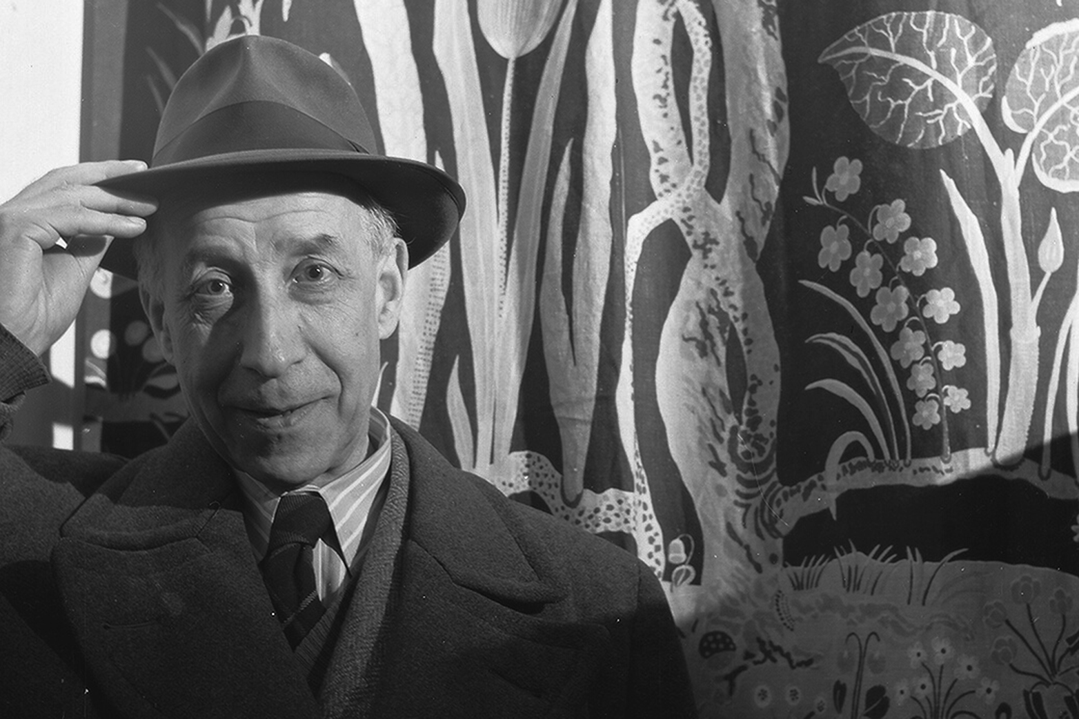
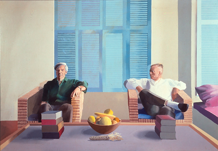
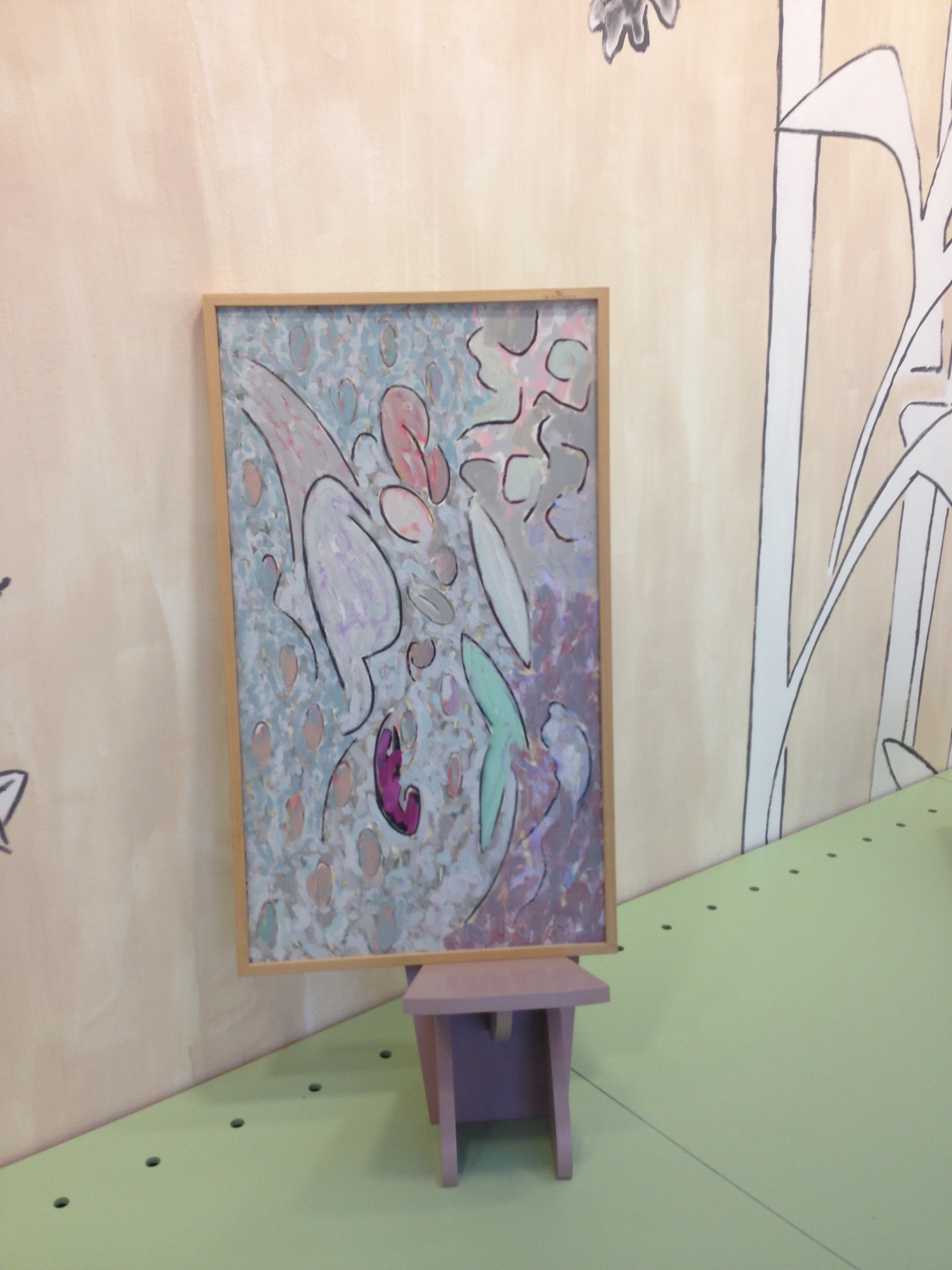
The artist Paule Vézelay has been very much out of the limelight since her last exhibition at Tate Britain in 1983. The current Spotlight show at Tate Britain will hopefully re-establish her place at the forefront of modern art.

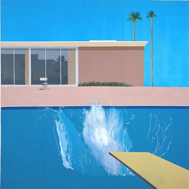
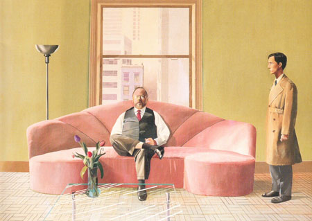
Despite her French sounding name she was born Marjorie Watson Williams in Bristol in 1892 but moved to Paris in the 1920’s and the influence of the abstraction of Joan Miro, Hans Arp, Kandinsky, and her partner Andre Masson can clearly be detected in her paintings.

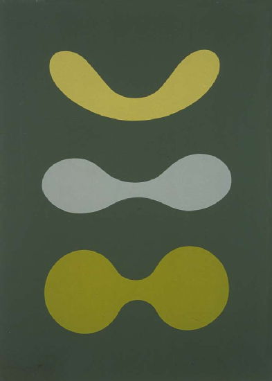
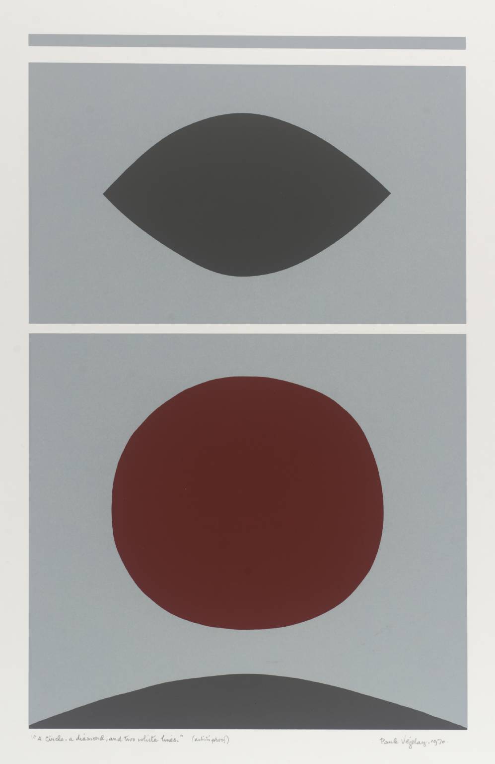
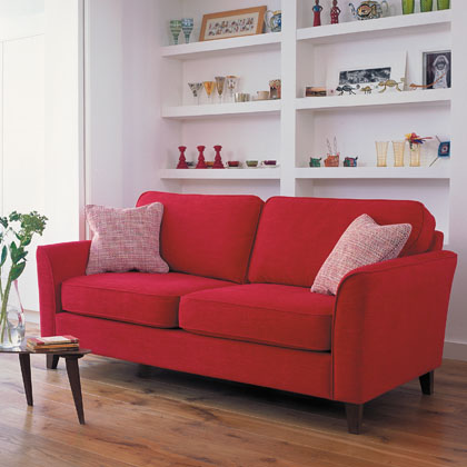
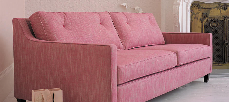
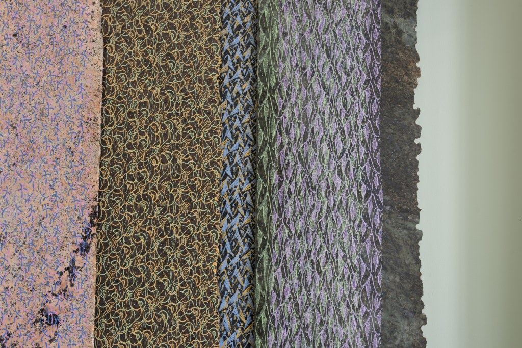
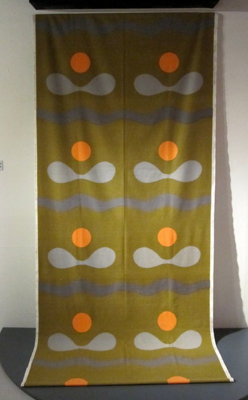
In the 1950’s she also started designing textiles, Tate Britain’s current show only has a few of her textile designs on display, but we were intrigued to discover more about her earlier work and also inspired to carry out some further research on her textile designs for companies such as Heals and Ascher. Her influence on contemporary design is evident, not just in her paintings but also in her post-war textile designs as can be seen in a selection of her bed-linens, curtains and furnishing fabrics below.

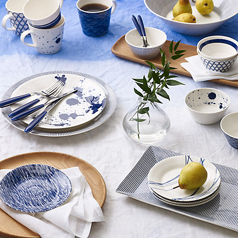
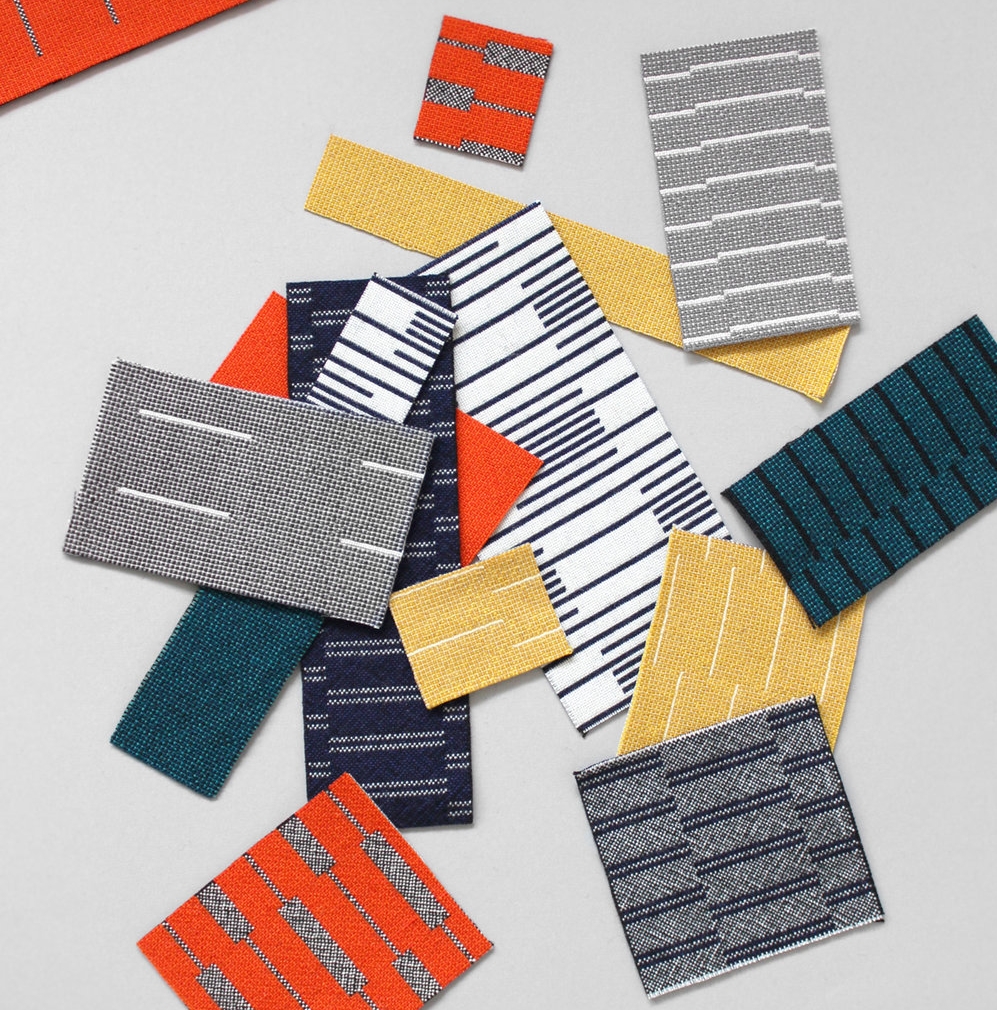
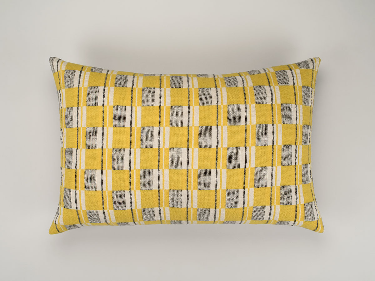
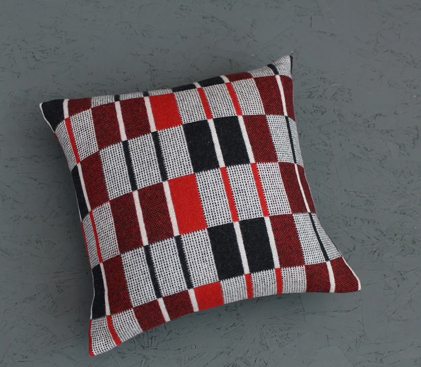
Orla Kiely is a contemporary designer whose retro designs are inspired by post-war textiles but with a modern twist. She particularly favours the textile prints of the 60's and 70's because of their resonance with the vitality of modern art of the period.

Orla Kiely Designs


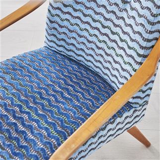
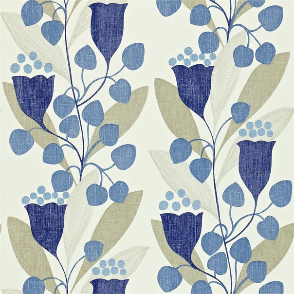
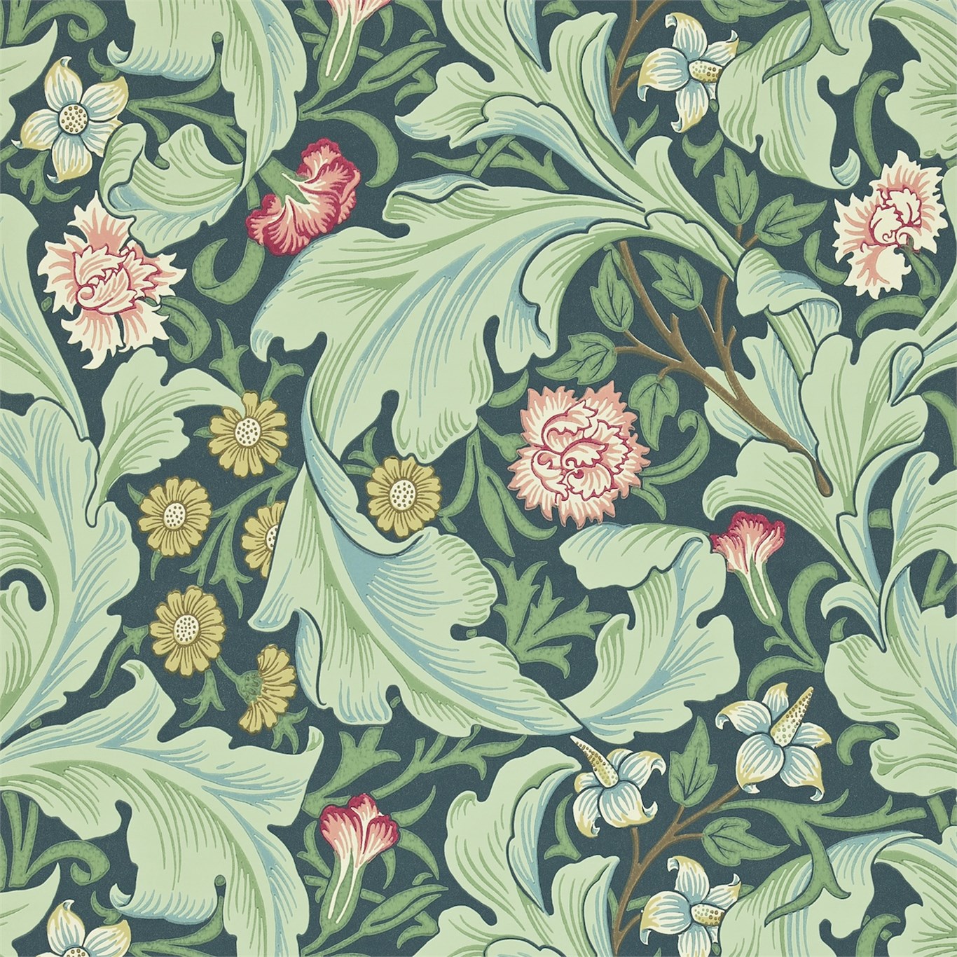
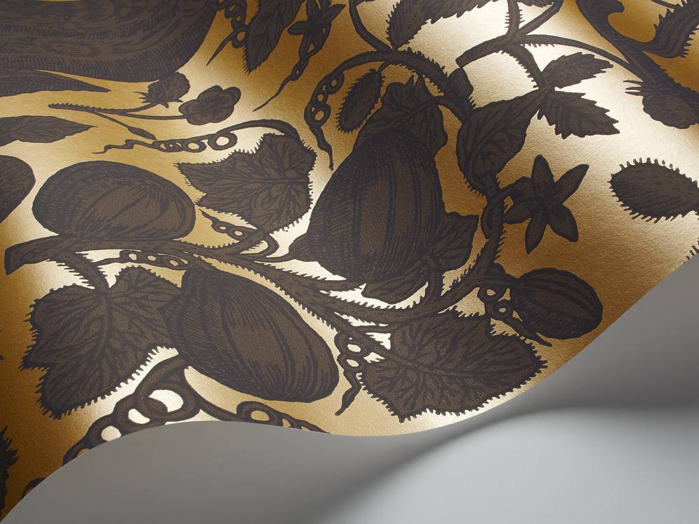
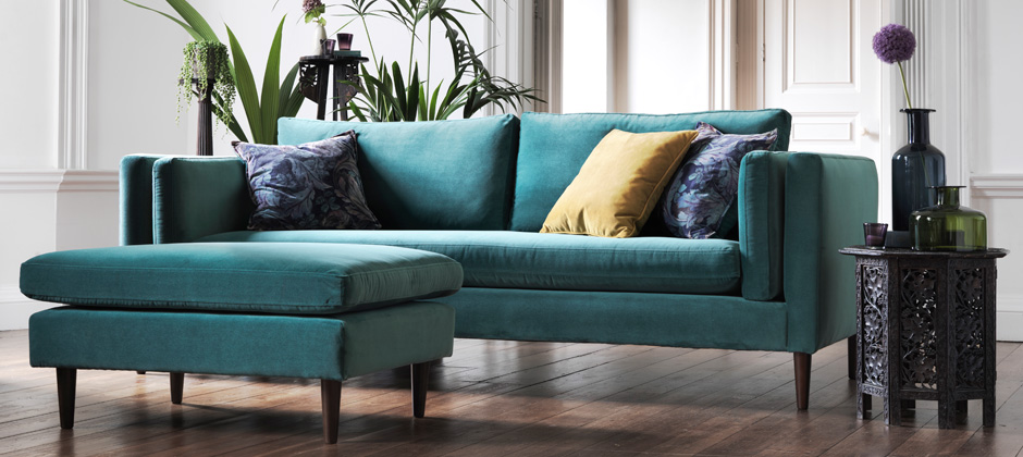
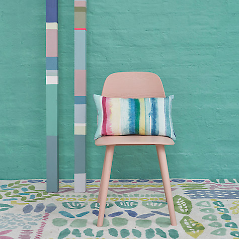
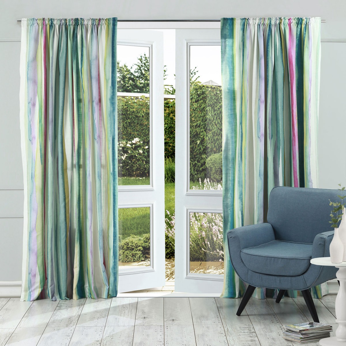
Designers Guild have a selection of furnishing fabrics and wallpapers, with a similar aesthetic but with an updated feel.

Designers Guild Furnishings


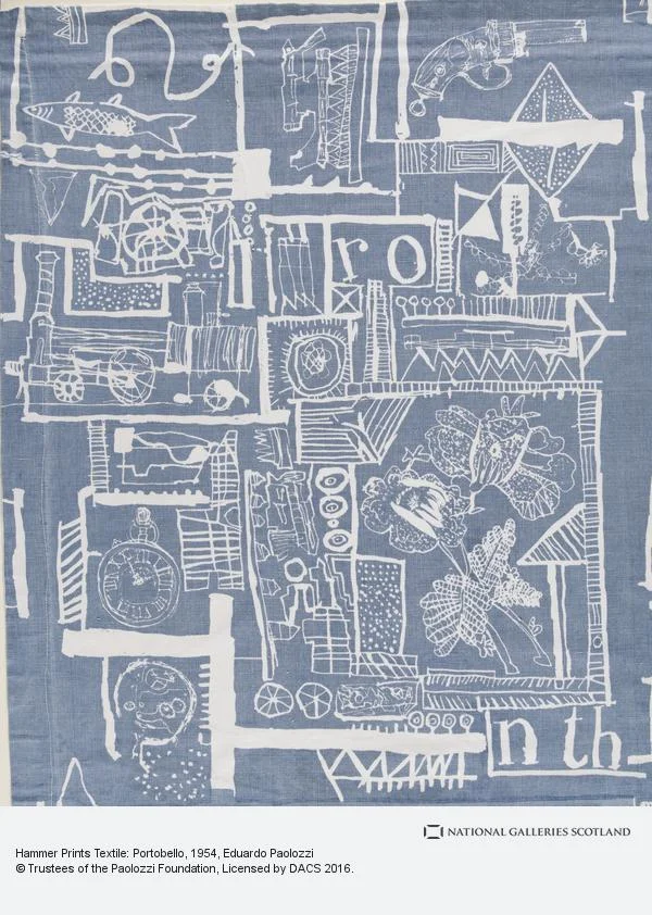
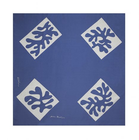
A number of artists, including Vezeley, put their art on silk scarves for Ascher from the 1940’s onward, with the idea of combining art with industry, demonstrating the connection between craft and art.


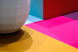
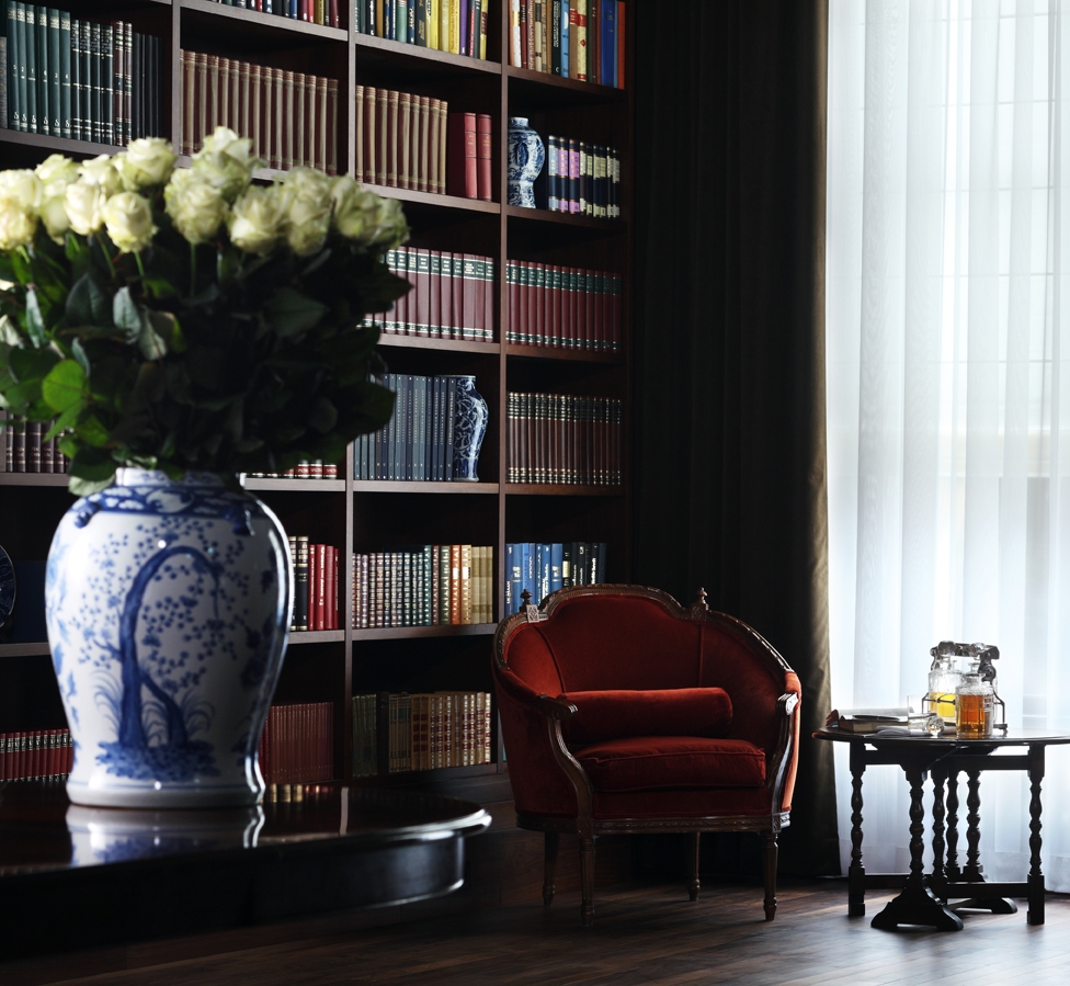
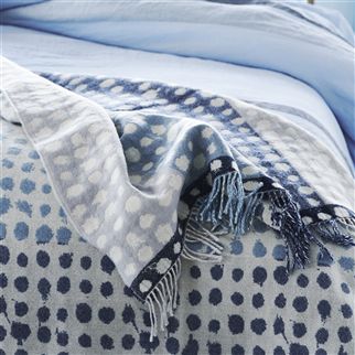
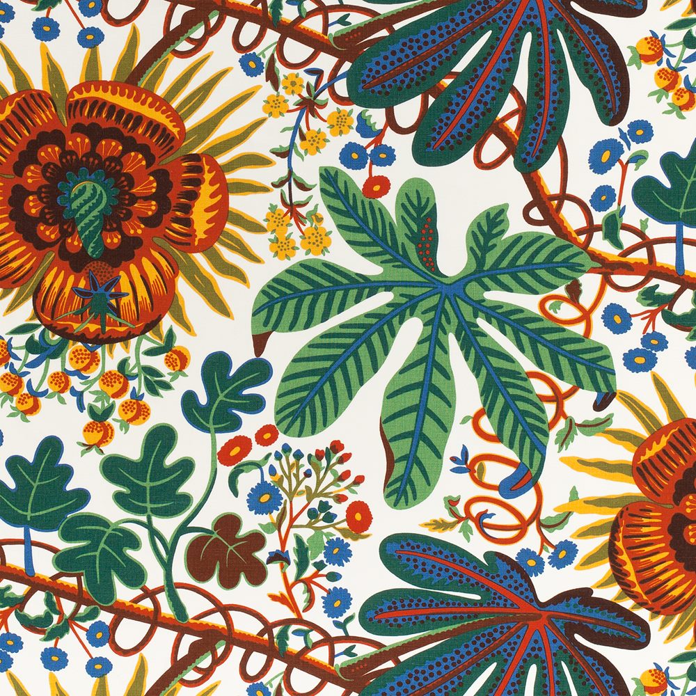
Take a look at our mood board of contemporary designs, textiles and furnishings which pay homage to the inspiration of 20th Century art in modern design ...

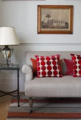
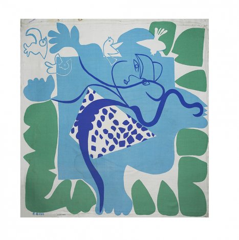
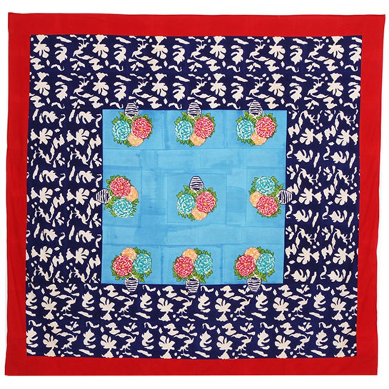
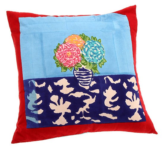
Lisa Corti is based in Milan and draws inspiration from the exotic and the painterly style of Matisse for her cushions, throws and bed linen.

Lisa Corti Designs


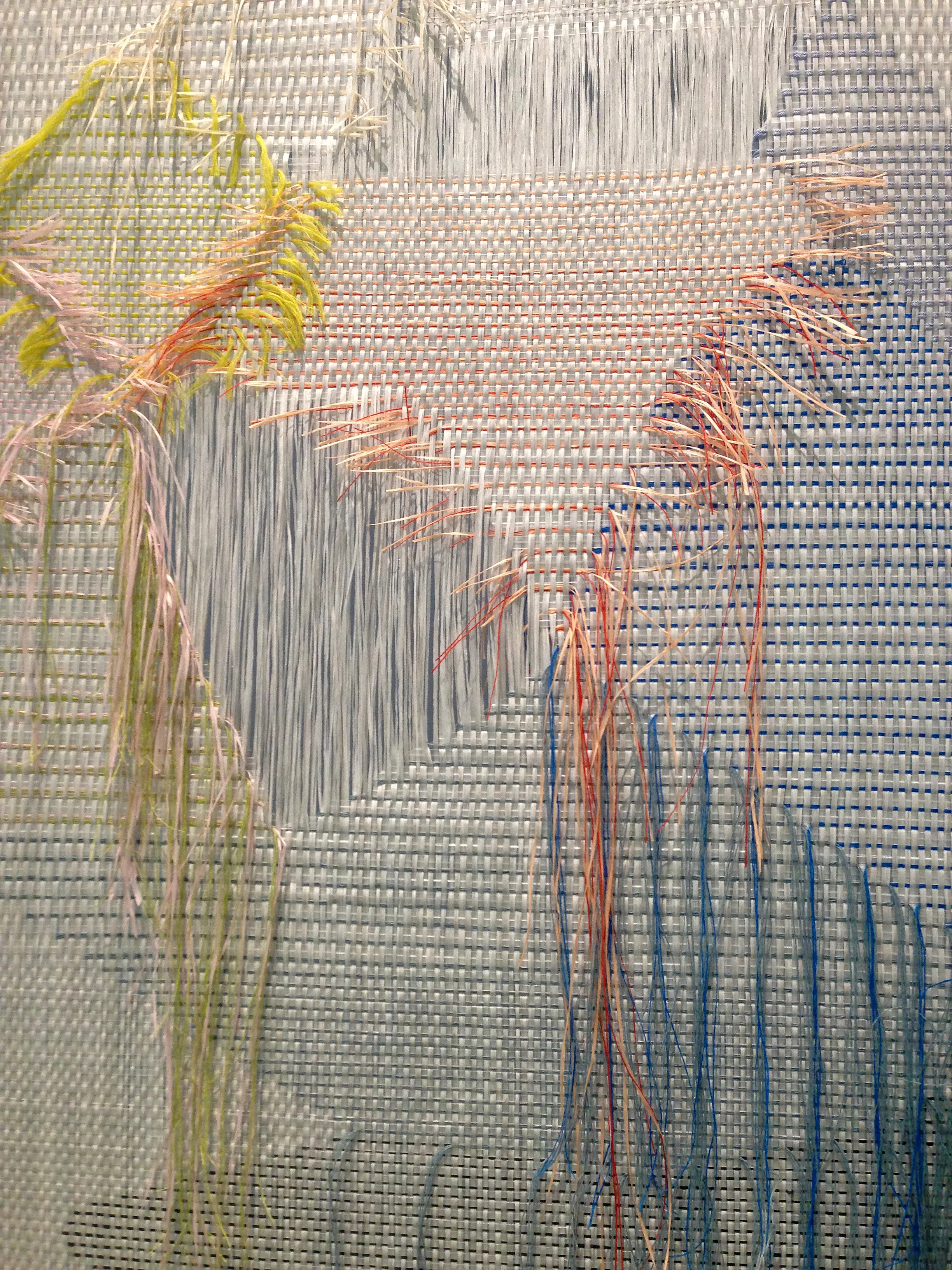
Maxine Sutton, based in Margate, originally trained as a fine artist and her current studio practise reflects this, she describes this interaction as “Holding on and Letting Go. In between cloth and paper”.

Maxine Sutton Designs


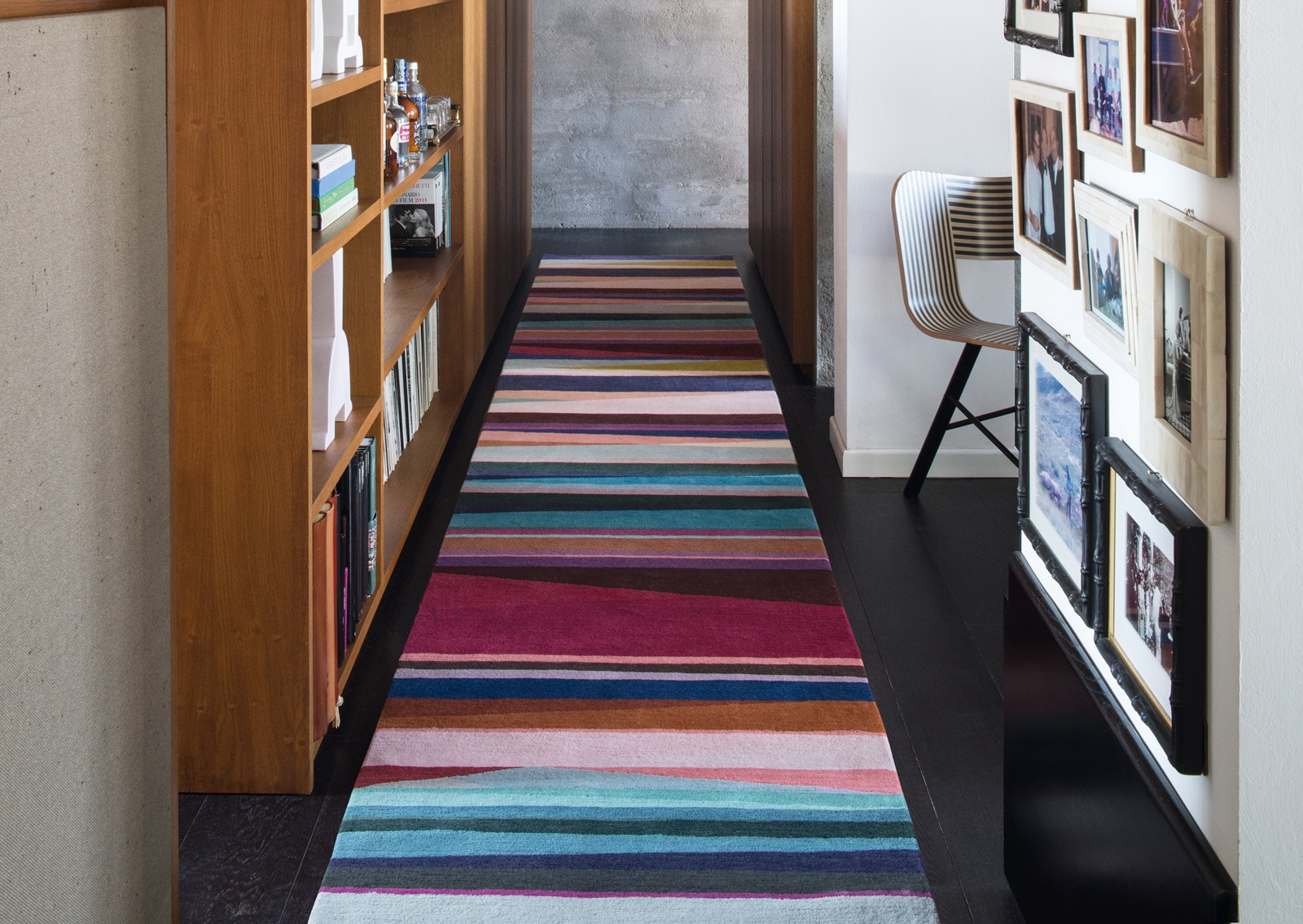
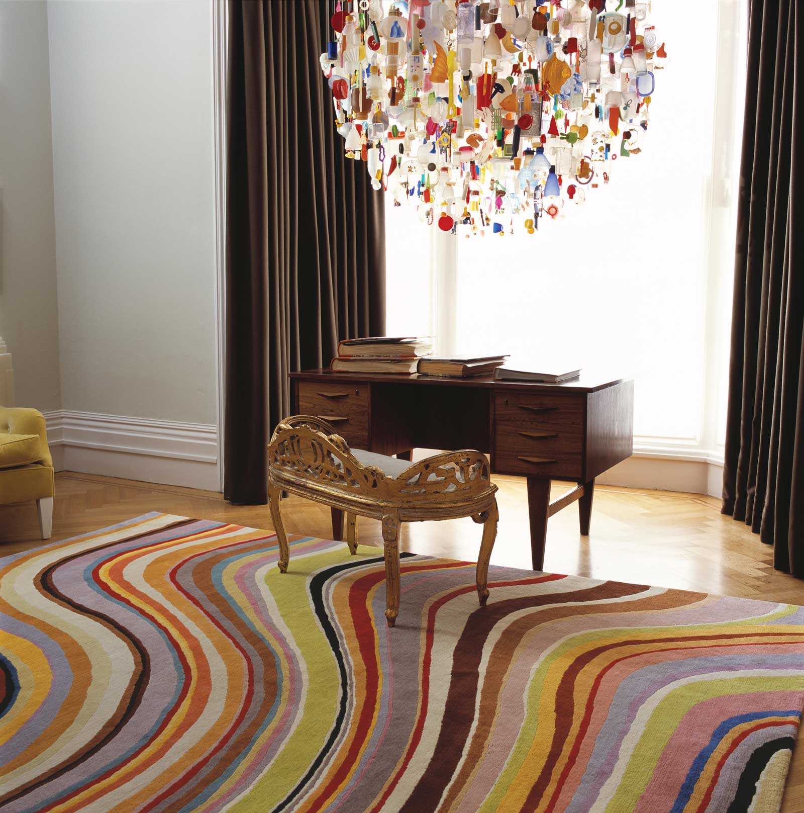
Helen Yardley's painterly rugs bring a living room to life with their vibrant tones. She describes her work as "fundamentally paintings about colour and shape and how they relate in space".

Helen Yardley


The Paule Vézelay Spotlight Display is open now until 5 November at Tate Britain.

Find out more by clicking here.

Breathing Colour by Hella Jongerius

"Colour is a visual experience, not a scientific one. When I look at designers and colour theorists work of the past, the most interesting ideas arose from questioning colour" 

Hella Jongerius -

Colour is one of the most important aspects to consider when planning our living and working spaces. Whether we are considering wall and textile colours or individual items of furniture and accessories, colour plays a key role in determining the mood and atmosphere we wish to create.

The Design Museum’s current exhibition, Breathing Colour by Hella Jongerius, is a joyful exploration of colour and how it enriches our lives and our environment.

The way we perceive colour can change depending on the time of day and the light available, both natural and artificial. By dividing the exhibits into separate spaces that simulate Morning, Noon and Night, we can see how colours change, subtly throughout the day, emphasising the importance that colour and design share.

Hella Jongerius is an industrial Designer who fuses industrial production with craft, and traditional with contemporary. She pursues her passion for colour in her designs for companies as diverse as Vitra and IKEA and the current exhibition draws on her many years of research.

"My research on colours, materials and textures is never complete ...

it is part of a never ending process”

A fascinating collection of faceted vessels called Colour Catchers demonstrate the way colour changes as light is refracted from the different surfaces and how a new colour is generated by shadows. These Colour Catchers also serve to engage us in Jongerius’ investigation into how we perceive colour.

Not just confined to hard surfaces, Jongerius is also fascinated by the way woven textiles can create an optical blend and a number of her textile explorations are also on display. These act as an explanation of the intricacies of creating colour through the natural warp and weft of woven fabric, and also demonstrate her respect of the rich tradition and history of craft.

"Cultural and historical awareness are woven into the DNA of any worthwhile product"

Hella Jongerius is convinced of the need to weave cultural awareness into her designs and recently worked alongside a theorist to create her manifesto Beyond The New as an exploration of her belief in combining traditional craft and manufacturing processes with contemporary design - read more here.

"Colour, and objects are influenced by the surrounding colour landscape"

As part of our own design ethos at Devas Designs we always start with a mood board which primarily focuses on colour schemes, then furnishings, working closely with the client to assess their requirements, and blending the old with the new.

Devas Designs - Country House in Ireland

This palette of soft hues of green, blues and greys reflects the seascape in this holiday home off the west coast of Ireland. Bursts of terracotta and red provide interest to an otherwise calm colour scheme.

An approach to creating modern interiors which successfully combine classic pieces with a sense of legacy, together with contemporary pieces has become very much a part of our style.

Devas Designs - Townhouse in West London

Sourcing antiques and works of art to enhance a contemporary lifestyle is one of the most exciting parts of Philippa's practice. Often an item of antique furniture, or a standout antique object, will provide a starting point, and drawing on its colour scheme or material can inspire and inform the overall interior.

We love the idea that simply by changing one or two items or adding colour in the form of accessories, an accent wall, or a piece of furniture it’s possible to transform and refresh an interior. While you may not always be ready to change the design scheme completely, it can be easy to ring the changes and add a few pops of colour for a special occasion or a seasonal makeover.

Here is our colour mood-board of ideas to inspire your own breath of colour ...

A stylish flower arrangement may be all you need to create a different mood. Colour doesn’t just mean bright; a calm palette of cream, whites and soft greys, is just as powerful an influence on our mood, and in setting the ambience of an interior.

Devas Designs interiors

Rebel Rebel are a London based contemporary flower company creating bold bouquets and displays. They also run flower arranging workshops - find out more here.

Breathing Colour by Hella Jongerius is on now at the Design Museum London, until 24 September 2017.

Find out more here

Plywood: Material of the Modern World

The Victoria and Albert Museum has been collecting furniture for over 150 years and is a rich source of inspiration for designers. Not to be missed is their thematically arranged collection in the Furniture Gallery. We recently visited their exhibition Plywood: Material of the Modern World which brings together some of the pieces.

Plywood: Material of the Modern World traces the history of an often overlooked material and how it transformed furniture design and the modern world. Who would have thought a material once considered utilitarian could have become such a direct influence on modern design?

Unlike industrial materials, plywood can be moulded in small scale factories using simple tools, and this inspired pioneering designers of the 1930s to experiment with form and shape.

The exhibition explains how plywood is produced, its history, from ancient Egypt, its re-emergence in the 19th Century and finally its role in revolutionising the production processes for an incredible range of objects from planes to skateboards.

1920s Plywood Skateboard, © V&A Museum London

Of particular interest to us at Devas Designs, were the ground-breaking designs by Alvar Aalto, Marcel Breuer and Charles and Ray Eames. Many of their furniture pieces are on display and the exhibits clearly show how the designers themselves have made use of the flexibility of the material and how it has informed their work.

"Form must have a content, and that content must be linked with nature" - Alvar Aalto

Finnish designer, Alvar Aalto was at the forefront of experimentation, manipulating and forming plywood to create his iconic cantilevered chairs. Aalto rejected mass production and embraced the ethos of organic forms created from natural materials, and rejected tubular steel furniture which was popular with the Modernist Movement at the time. The introduction of plywood allowed him to create flowing simple forms which didn't rely on traditional frame construction.

Designs by Alvar Aalto

Ikea is a great source for inexpensive furniture inspired by the classics such as these stacking stools based on Alvar Aalto's design and this simple birch plywood chest.

Ikea's Frosta stools and Moppe chest

"I am as much interested in the smallest detail as in the whole structure" - Marcel Breuer

The architect and furniture designer Marcel Breuer based this birch and plywood chair, below, on an earlier aluminium chair he had produced in 1932. Inspired by Alvar Aalto's use of plywood, and realising the appeal of the soft curves and the warm appearance of wood, Breuer went on to reproduce the design in plywood for the British market while working in the UK with ISOKON. The company is still going strong and a number of Breuer's designs are available to order alongside a number of other iconic designs from the 1930s.

Isokon, based in London's Hackney Wick, also produce contemporary pieces of handcrafted furniture such as this Loop Coffee Table and Bodleian Chair, both are contemporary pieces but clearly inspired by the clean lines and sculptural, organic forms of both Alvar Aalto and Marcel Breuer.

Isokon's Bodleian Chair and Loop Coffee Table - from their contemporary range

"I feel that the knowledge about an object can only enrich your feelings for the object itself" - Charles Eames

Charles and Ray Eames, the husband and wife team who created the Eames Look, with its sleek, sophisticated and beautifully simple forms, were inspired by Aalto and his use of Plywood which they described as ‘a flash of inspiration’. Many of their plywood moulded forms also incorporated their signature chrome tubular frames.

The Conran Shop is always a great source for simple classic styles very much inspired by the work of Eames, Aalto and Breuer.

Conran Shop designs

Finally we also spotted these very decorative vintage posters at the V&A's exhibition, celebrating the progress of new ideas and innovations in the world of design.

Kiki Werth is a London based dealer who has specialised in original vintage posters for over 30 years. We picked some of our favourites ...

Kiki Werth vintage posters

We also liked the Vintage reproductions by King & McGraw which are expertly printed in their Sussex studios, to exact museum conservation standards using inks and papers developed to create a perfect reproduction.

Vintage reproduction posters by King & McGraw

Plywood: Material of the Modern World is open now at the V&A Museum in London until 12 November 2017. Click here to find out more.

Clerkenwell Design Week

"Colour is my passion. My designs are fundamentally paintings about colour and shape and how they relate in space…. Take one colour, add another and there is a dynamic”

Helen Yardley, Textile Designer

Clerkenwell Design Week

#CDW2017

Clerkenwell was a recent hub of creativity as it once again hosted Clerkenwell Design Week. Devas Designs was impressed to see such a diversity of talent and what also caught our attention was the number of designers and manufacturers dedicated to returning to hand-crafting traditions and materials and a commitment to sustainability and ethical production. With this in mind here are just a few who really stood out for us.

Bermondsey based British Designer Helen Yardley, is a graduate of the Royal College of Art, where she studied Textile Design. Helen is known for her painterly style and dramatic use of colour. Initially attracted to designing rugs, seeing them as ‘drawings for floors’, Helen has been producing handcrafted rugs, runners, carpets and wall hangings for over 25 years. Through her process and by manufacturing in Britain she aims to reduce the company’s carbon footprint. 
Here are just a few of our favourite designs ...

We were greeted by a quirky colourful Installation designed by Hakwood flooring, amusingly called Double Vision, which they produced specially for the Event. Hakwood are a Netherlands-based manufacturer, producing environmentally responsible hardwood floors which include reclaimed antique woods.

A wonderful canal-side loft apartment in Amsterdam blends the history of the classic Dutch warehouse with a contemporary feel. This is enhanced by the clever use of different Hakwood flooring to define spaces and incorporates the clients request for a black and white interior theme.

Bute Fabrics is based on the Isle of Bute in the Firth of Clyde in Scotland. Having established their traditional hand-loomed woollen textile business in 1947, they still share a commitment to serving the community and a reliance on traditional methods of production. The local landscape and the Island’s natural colours, textures and patterns is woven into their designs making them bold, bright and contemporary. 

From traditional tweeds to block colours their range is so eclectic it’s possible to create a bold statement piece like these Twin Tone cushions or something more subdued to blend in with the interior scheme.

Another Country, based in Marylebone, is another design company with high standards of responsibility, only using sustainably harvested timbers for all their furniture. Their designs are inspired by British Country and Shaker style and also call on Japan and Scandinavia as inspiration for their unpretentious forms. Every piece is hand-finished and hand-assembled. The simplicity of their designs and truth to their materials blends comfortably with both traditional and contemporary schemes.

Laura Spring is a textile designer and maker, having graduated from Glasgow School of Art, she now lives and works in Glasgow. Laura uses bold graphics combined with bright colours to produce beautifully crafted products. This, combined with ethical methods of production, are a signature of her beautiful hand-woven rugs, textiles and accessories. She often incorporates traditional tie-dye techniques from Jaipur in her designs. Her enormous love of colour print, pattern and process are evident in these beautiful accessories and furnishings

The British Collection showcased some of the most exciting UK designers latest designs in the unique setting of the barrel vaulted crypt of St. James’s Church on Clerkenwell Green. We were particularly drawn to the Classic English Kitchen on display from deVOL Kitchens who are based in Leicestershire but also have a showroom in Clerkenwell. DeVOL have been creating handmade bespoke kitchens for almost 25 years and pride themselves on their use of sustainable British timbers.

They describe their look as a ‘beautifully considered mix of classic and contemporary design’ and we couldn’t agree more.

This is an ethos which is very much at the heart of Devas Designs, and a theme we aspired to, in creating these classic kitchens for our clients in County Mayo and the Irish countrside.

Tulips from Amsterdam ...

'Choose only one master - nature'

- Rembrandt van Rijn -

May is a wonderful time of year to visit Amsterdam. Even if you don’t venture out into the tulip fields you won’t miss the flowers as the city of Amsterdam is ablaze with tulips. A visit to the Amsterdam Flower Market is uplifting, situated on the banks of the Amstel, with its cafes, shops and delightful gabled Dutch houses.

A well as the colourful displays of flowers the classic colours of the Dutch buildings are inspiring.

Papers and Paints in London’s Park Walk have an incredible range of traditional paint colours and will also mix and match tailor-made colours using a unique method called spectrophotometry to ensure complete accuracy and since 1995 have developed unrivalled expertise in this work. You can take a sample as small as a flake of paint or a small swatch of fabric and they will colour match for you. We couldn’t agree more when they say that colour is one of the most important choices we can make.

The Modern Dutch style shares many of the aesthetics of Scandinavian Style in terms of utilising natural light sources, an effective use of wood and a palette of gentle hues. Soft blues and greys against pale walls, sometimes with a signature wallpaper or colour, and an emphasis on the family dining table at the heart of the home all add to a harmonious living environment. The interior details and table linen below are from Designers Guild while the table setting and crockery are from John Lewis.

One of our favourite hotels to stay in Amsterdam is Hotel De L’Europe in the heart of the city overlooking the beautiful Amstel and a stone’s throw from the Rijksmuseum. The hotel exudes an air of sophistication and interestingly has used oversized images of Dutch Masters on the walls. These have been recreated from the collection of the Rijksmuseum.

Did you know....

Europeana Collections has, alongside other organisations and initiatives, worked with The Rijksmuseum since 2011 to make their public domain collection available online without restrictions. This has resulted in over 150,000 high resolution images for anyone to view, download, copy, remix, print and use for any purpose.

See more by clicking here.

The occasional signature of traditional Dutch tiles and Delftware are used in a very understated way at Hotel De L’Europe but are cleverly combined with contemporary elements.

We also love to add accessories and textiles to ring the changes. Take a look at our Delft inspired mood board for a contemporary Dutch look - which includes accessories from Designers Guild. Their Delft Polonaise cushion and Murrine Delft fabric echo the blues of traditional Delft tiles.

As a starting point, we are often asked to take into consideration a client’s own personal collection of art and antiques when designing a new scheme or focus on a particular element they wish to incorporate. Our client in Ireland had an interesting collection of pottery and the inclusion of this very personal collection was a prime consideration.

Josef Frank: Patterns, Paintings, Furniture

“There’s nothing wrong with mixing old and new, with combining different furniture styles, colours and patterns. Things that you like will automatically fuse to form a relaxing entity.”

- Josef Frank -

We recently visited the Fashion and Textile Museum in London’s Bermondsey, to see the work of Josef Frank. This is the first ever UK exhibition of his textiles, furniture and vibrant fabric designs and also includes a collection of his previously unknown watercolours.

Although he was born and raised in Austria, Frank emigrated to Sweden, and together with the company Svenskt Tenn he redefined what is regarded as the Swedish Modern style. His work celebrates comfort, positivity and homeliness, and just taking a look at his work is a wonderfully uplifting experience. 

Josef Frank’s textile designs, his prints of fruits, flowers, trees, and foliage, weave together in a glorious celebration of nature. ‘Himalaya’ was one of his final prints made in 1950 and sums up his love of colour pattern and a perfect world.

After the 1950’s, Frank started painting watercolours. Having used watercolours as his medium for creating his print and textile designs, he was experienced in the technique and went on to produce over 400 paintings. Some of these express his most popular prints such as ‘Tulpaner’, Tulips.

Many of Josef Frank's wallpapers and textiles are still available from Svenskt Tenn Sweden, and even the lower budget IKEA has produced ranges of both furniture and wallpaper inspired by his design ethic. We have put together some design ideas of our own which we feel celebrate nature, pattern, and texture in a way which reflects Josef Franks ethos. A number of our favourite companies include botanical images in their design.

We were particularly drawn to Rose Dust rug by Vivienne Westwood and also The Oriental Bird rug by Paul Smith, both for The Rug Company.

These handcrafted chairs from Sofa Workshop covered in botanical prints echo Franks' emphasis on comfort, combined with floral textiles.

When it comes to wallpapers, we found these subtle designs from Designer Wallpapers would work well as a signature wall covering.

Anthropologie has produced a range of home accessories which call on a botanical motifs. Just a few items from this range could bring a touch of summer to your scheme or liven up your summer table for al fresco dining.

Nisha Crosland is one of our go-to British Textile designers and this rug and wallpaper perfectly complement the blending of traditional with a contemporary feel.

Blending antiques with more contemporary items is a theme we use frequently, and in this Queens Park apartment Devas Designs used a subtle, signature Neisha Crosland Wallpaper to create a harmonious bedroom sanctuary for our client.

We were also excited to discover that Josef Frank was inspired by the work of British textile designer William Morris and his Arts and Crafts aesthetic. In particular his revival of the art of traditional pattern design, and his method of creating pattern repetition, drawn from nature, in order to create a mood of harmony and tranquillity were a source of motivation to Frank. These examples of Morris’s textiles from Cole and Son and an interior by Josef Frank clearly show the correlation between the two designers.

Josef Frank’s design ethos encapsulates the aims of Devas Designs, to provide interior solutions which blend traditional with modern to create a comfortable living space with a distinctive style.

Josef Frank: Patterns - Furniture - Painting at The Fashion and Textile Museum is on now until May 7th 2017.

Click here to find out more.

Eduardo Paolozzi: His Art and Craft

"As an artist it is sometimes difficult

to draw a line between art and craft"

- Eduardo Paolozzi -

Devas Designs recently visited the Eduardo Paolozzi show at The Whitechapel Gallery. It celebrates Paolozzi's love of the creative process  and introduced us more fully to his love of textiles, ceramics, home-wares, furnishing fabrics and wall paper designs. 

Not only did he produce his familiar collages and screen prints, but he also taught textile design at the Central School of Art & Design, many of his prints echoing organic forms and utilising collaged images.

In the 1950's he formed a partnership with the architect Nigel Henderson to create Hammer Prints Ltd. and many of the designs were produced by wallpaper company Cole & Son. Their modern re-imagining of his 1950's 'Cowcumber' design, which features a botanical print, is still produced by them today.

With Nigel Henderson, Paolozzi went on to produce a wide variety of imagery on textiles, ceramics and home-wares. Their designs drew on diverse styles from the influences of the Omega Workshop to Abstract Expressionism and Marcel Duchamp, and combined their own individual backgrounds. They had a shared interest and appreciation of craft, production and the new, post war mass culture. This collaboration resulted in a very unique and eclectic practice, such as this humorous plate, and vibrant textile design.

We were also taken with this curtain fabric titled 'Portobello'. It is based on pen and ink drawings by Paolozzi of antiques from Portobello Antique Market in the early 1960’s and it reminded us of French Toile de Jouy furnishing fabrics.

Devas Designs went in search of decorative items which could echo Paolozzi’s love of form, colour and individuality. We came up with a number of solutions including these rugs from The Rug Company which we feel echo Paolozzi’s love of geometric form and would liven up an interior without compromising the other elements in the design, like this one in a narrow library area. This swirl patterned rug, also from The Rug Company is designed by Paul Smith and is a brilliant illustration of how contemporary and traditional design can be brought together by the clever use of accessories and textiles.

We were thrilled to discover the work of Eleanor Pritchard who designs her textiles from her London studio, the resulting designs are produced by highly skilled British weavers using traditional weaving methods in mills in Lancashire, Wales and Scotland.

This gorgeous navy and white throw, and cushions all made using the hand woven tradition, particularly caught our eye, we feel they reflect the ethos and style of Paolozzi & Henderson and would work well in both a traditional or more minimalist interior.

Despite not having trained as a potter, Paolozzi taught ceramics at the Royal College of Art. We particularly like these silk screened, limited edition porcelain plates which Paolozzi designed for Wedgwood, in the 1970’s which demonstrate his love of geometric forms and this elegant tea pot for Rosenthal.

Lubna Chowdhary is another London based designer we are excited to discover through our interest in the work of Edwardo Paolozzi. Lubna is his former pupil having studied for her ceramics MA at the Royal College of Art. Her ceramics are individually glazed and hand crafted and she draws inspiration from Paolozzi’s exploration of colour on flat surfaces as can be seen on his public mosaics.

As well as large scale commissions, Lubna also produces small scale mosaics suitable for domestic interiors and provide an interesting alternative to a painted canvas. We used a mix of antique and modern to create an atmosphere of light, space and comfort in this apartment for our client in Queen’s Park, London. The addition of cushions with a similar motif to Lubna’s eye catching, Paolozzi inspired ceramics, provides additional interest and updates the theme.

'Eduardo Paolozzi' at The Whitechapel Gallery is on until 14 May 2017. Click here to find out more.

The Decorative Antiques & Textiles Fair 2017

Devas Designs was thrilled to see some regular exhibitors alongside newcomers at The Decorative Antiques & Textile Fair in Battersea Park last week. The fair included a very eclectic mix of stunning antiques and decorative items from France, Italy, Sweden, Spain, the UK and beyond. The fair originally started in 1985 and is now a major annual fixture on our calendar, a must-see event which covers everything from textiles, and furniture to ceramics and paintings.

We were glad to see some regulars are back again plus some new exhibitors. The Fair is always a very exciting show and as you will see from some of the items we have picked out, this one did not disappoint.

We were particularly attracted to some of the luminous glass wear from James Miles Ltd such as this blue glass vase and this stunning pink glass dish. We were also drawn to their collection of Poole Pottery.

We loved the elegant lines of this 1958 mid-century chair by Arne Hovmund-Olsen. The graphic impact of this piece is reminiscent of the Vienna Secessionist work of Josef Hoffman.

We were also drawn to this vase from Justin Evershed Martin, crafted by Carlo Moretti who owned an artisan factory in Murano, creating pieces in the traditional manner using glassblowing techniques but adding contemporary design.

Da Silva Antiques are based in London, her selection of decorative items and original vintage pieces is constantly updated. We were pleased to find this eclectic range of cushions using antique fabrics, with such a wide selection we will be keeping an eye open for suitable pieces.

3details is another company which surprised us with this work by British artist Peter Woodward, who is both a painter and print-maker. This arrangement of vessels depicted in neutral tones relies, primarily, on the arrangement of form and texture. He sources antique frames for his work, which he painstakingly prepares, so that the frame becomes almost part of the painting itself. These works would lend themselves to both a modern and a traditional interior.

Finally we were fascinated to learn that 3details hold a unique collection of 'rescued' artefacts from Jim Dine’s former London home. Jim Dine is considered to be a pioneer of pop art and part of the Neo Dada art movement, he currently lives in America. The ‘found’ works, include  memorabilia, and artworks and were only rediscovered recently. This is just a small selection from their extraordinary find. 

David Hockney at Home

David Hockney is one of Britain’s most popular artists, Devas Designs caught up with his latest exhibition at Tate Britain and what a fantastic show it is. It covers six decades of his work from London in the 1960’s, his swimming pool era in Los Angeles, and landscapes of his hometown in Yorkshire. What stands out so clearly is his depiction of colour and light which we can use as inspiration for our own interiors.

We’ve put together some ideas from his paintings to get the 'Hockney Effect' in interiors settings ...

Inspired by his colour themes and swimming pool paintings, why not choose your own combination of Hockney coloured tiles using Johnson’s clever ‘colour genie’, which makes it so simple to get the look. Try the 'colour genie' for yourself by clicking here. Here's our own colour genie result, drawing inspiration from Hockney's swimming pool paintings.

Many of Hockney’s paintings depict friends and family in domestic settings which gives the work added poignancy such as the touching painting of his parents below. 

Sofaworkshop pride themselves on providing the ‘best of British’ craftsman made sofas, their latest collection includes sofas and chairs in vibrant and pastel colours which reflect Hockney's domestic scenes.

If you simply want to ring the changes, take a look at this dazzling array of bright silk or velvet finish cushions from the John Lewis range. At just £25 each you can create an immediate pop of colour for an instant ‘Hockney makeover'! Changing cushions and accessories, seasonally, or as the mood takes you, is a fun and inexpensive way to shake up your interiors and give your home a whole new feel.

The Conran Shop is always a source of great ideas. Jasper Conran, who took over the helm in 2012, has a number of colourful solutions which include mixing colours to break away from a uniform look.

It doesn’t just have to hinge on ‘eye popping’ colours though. A softer approach using pastel hues and elegant flower arrangements are reminiscent of the cool interior of Hockney’s Mr and Mrs Clarke and Percy. He has painted this colourful couple relaxing in the cool interior of their Notting Hill apartment. The painting immediately brought to mind the West London townhouse designed by Devas Designs, shown below.

... And don’t forget to create your own green oasis, where you can escape the hustle and bustle of the city and relax, as we did here for a London client.

If you want to add temporary colour to your own garden or balcony try a simple row of coloured plant pots with brightly coloured flowers or cactus inspired by Hockney’s garden paintings.

London Art Fair 2017

Alongside our Interior Design services, Devas Designs specialises in buying artwork for clients. Whether you’re looking to start a collection, add to an existing collection or search for that one perfect piece - we have the expertise and contacts to help you.

Naturally we’re always on the look out for new and exciting pieces and visit as many fairs and exhibitions as we can. Last week we took a trip to the London Art Fair, which focusses on modern British and contemporary art. Here’s our top picks from the fair …

Winifred Nicholson at Crane Kalman Gallery

Winifred Nicholson was a colourist and her beautiful impressionistic style has always caught our eye. She concentrated on domestic still life objects and landscapes, often combining the two by depicting nature through a window, for example.

She was married to painted Ben Nicholson who focussed on more abstract scenes. There is a lovely soft quality to her work; both in the colours and treatment of paint. The lightness and optimism created would makes a lovely addition to an interior as tehse qualities compliment an existing colour scheme while adding a splash of colour to the space.

Joakim Eskildsen at Purdy Hicks Gallery

Joakim Eskildsen is a photographer from Copenhagen. His series Nordic Signs was produced between 1989-1994 and resulted from his travels between Northern Europe, featuring Norway, Scotland, Denmark, Sweden, Iceland and the Faroe Islands.

In his series, Eskildsen draws out the poetic qualities of these landscapes with an emphasis on the atmospheres created by the elements. They were a collaboration with his wife, the poet Cia Rinne. He was inspired by the way Renaissance painters portrayed light and used some of these techniques in his photographic work. He says these images capture “something that is at the same time wild yet liveable”.

Abe Odedina at Ed Cross Fine Art

Born in in Nigeria in 1960, Abe Odedina lives and works in London. He is a self-taught painter, having trained originally as an architect. A trip to Brazil ignited Odedina’s interest in painting and particularly the the voodoo arts of Haiti and the Painters of the Sacred Heart.

Odedina's work celebrates the use of colour and pictorial statements, qualities in artwork seen on the streets of cities such as Lagos, Salvador and Port-au-Prince. The figures are painted in acrylic on plywood in a bold and stylised manner. He often incorporates text which explores universal themes and believes that art has the power to transform reality. 

Devas Designs' Guide to The Christmas Table

We all know that the best kind of Christmas is spent mostly around the dining table, let your table shine through this year and as a welcoming centre-point for your guests. Take a look at my simple steps and festive ideas for an ideal Christmas table:

1/ PLAN AHEAD

Planning ahead is crucial, especially if you are expecting the whole family. In the week running up to Christmas Day (now!) count your cutlery, crockery and baking dishes. Make sure you have enough for the courses you are planning to cook and be sure to have them washed and stacked ready, on the day before.

Image from The Prop Dispensary

2/ SET A COLOUR SCHEME

A specific theme or colour scheme is a must for creating a simple yet dramatic look. We enjoy matching our table to our home’s decorations. You might like to work with one, two or three colours which can tie the table together harmoniously - for example a white tablecloth with a red runner and red napkins with gold accessories. Monotone tables also look beautiful and can guarantee elegance; all white with silver is a personal favourite.

Image from The White Company

3/ ADD SOME CHRISTMAS SPARKLE OR A LITTLE LUXURY

Once you have a basic colour scheme with a simple spread, it’s nice to add a little touch of luxury to the table. This might be using your finest silverware or adding some luxurious fabrics; my go-to is vintage white linen. Candles and decorated holders can add instant sparkle while retaining a warm, welcoming atmosphere.

Image from Magnolia Rouge

4/ PERSONALISE IT

Personal touches can enliven your table with charm and make it memorable for your guests. These can be very simple touches from wrapping napkins with a bow to placing personalised name cards for your guests. If you have children they might like to help you by writing cards or decorating their own candle-holders.

Images from Camille Styles & ES

5/ DON’T FORGET THE FESTIVE FOLIAGE

I love adding a natural element to the table by using flowers or festive cuttings. White or red roses always look glamorous, particularly if placed in a tall glass vase. If you’re worried about vases cluttering up space, try placing fir tree or mistletoe sprigs for a festive touch. Herb sprigs can also work wonderfully, particularly rosemary as it echoes the tastes and smells of your Christmas cooking.

December Art Fix: Top 3 Exhibitions

1/ Zaha Hadid: Early Paintings and Drawings

Serpentine Gallery, Until 12 Feb 2017

The latest show from the Serpentine Sackler Gallery celebrates the early drawings and paintings of late architect Zaha Hadid, her spectacularly designed restaurant adjoins the gallery. The pieces on display were created before her first building; The Vitra Fire Station, and show her visualisations of space and ideas. 

There is a clear Constructivist influence in her painted works, there are geometric, angular forms reminiscent of Tatlin and Malevich. One project is based on Malevich's Architekton, a architecturally inspired sculpture he produced in the 1920s. Hadid reproduced the sculpture, painting it from a birds-eye-view and gave it a new London setting on the South Bank. Hadid's architectural and painterly fusions are truly inspiring and these early works confirm her dedication to developing unique and radical work.

2/ Bruce McLean: A Hot Sunset and Shade Paintings

Bernard Jacobson Gallery, Until 28 Jan 2017

British artist Bruce McLean has been a long time favourite artist of the Devas Designs team. McLean's bold approach to colour and form is uplifting and eye-catching - criteria we always look for when buying art for the home. McLean is a multi artist who works across painting, sculpture, printmaking, ceramics, film and performance art. He is known for both his versatility and rebellious spirit, often mocking the establishment - when offered an exhibition at Tate Britain in 1972, he held a 'retrospective' which lasted only one day.

McLean's current exhibition at Bernard Jacobson presents recent works, all produced over the last year. These include six 'shade' paintings, a series which explores light and shadow, as well asa standout six-meter long minimalist painting called 'sunset'. The works of display are above all beautiful and high spirited; perfect viewing for the cold, Winter months.

3/ Robert Rauschenberg

Tate Modern, Until 2 April 2017

'Robert Rauschenberg blazed a new trail for art in the second half of the twentieth century' declares Tate. This show sets out to confirm Rauschenberg's place in modern art and outline his radically new approach and new aesthetic that acted as a bridge between Pop Art and Abstract Expressionism in the 1950s. There are works that span the entirety of Rauschenberg's influential career from his early experimental works in the 1950s to the work he created before his death in 2008.

There are several landmark works here including his famous 'Monogram' work which features a stuffed goat with a tyre around its waist. Another room shows his dedication to screen printing and the incorporation of Popular imagery, inspired by a visit to Warhol's studio. His important and longstanding collaborations feature too, including the many stage design created for Merce Cunningham's choreographed performances, all of which were scored by John Cage.

Robert Rauschenberg was born in Port Arthur, Texas. He grew up in a Fundamentalist Christian household of strict rules and regulations before being drafted in to the Navy for three years. His life story is a captivating tale of how one man broke away from convention to challenge and enliven the art scene, an agenda which would change contemporary art forever. Tate's Robert Rauschenberg exhibition is a must-see.

November Art Exhibitions

Looking to escape the Winter weather? What better way to hide from the cold than to spend the weekend at a London art gallery. Here's our top three new art exhibitions to visit this November ...

1/ The Radical Eye: Modernist Photography from The Sir Elton John Collection

Tate Modern, Switch House - Until 7 May 2017

Tate Modern’s latest show may come as a surprise to some visitors; it showcases a dynamic and important collection of modernist photography from the Rocket Man star. There are nearly 200 works on show, selected from Sir Elton John’s incredible photographic collection. Some of the biggest names are here; May Ray, Dorothea Lange, Brassai, Andre Kertesz and Aleksandr Rodchenko and more.

The works have been beautifully selected and act as an introduction to Modernist photography; its themes, values and movers and shakers. As well as being visually striking, each print is in remarkable condition; many of the works were bought direct from the artists. It’s also worth picking up an audio guide where you can hear from Sir Elton John himself discussing his personal thoughts on the works.

‘I collect for the beauty, not the value. I’m in awe of these things’

2/ Flaming June: The Making of an Icon

Leighton House - Until 2 April 2017

One of the most iconic and reproduced paintings from the Victorian Era, Flaming June, is now back on display at the studio it was created in 1895. It was painted by Sir Frederic Leighton, the English painter and sculptor now known for his elaborate Leighton House.

The painting is a beautiful and sensual work, richly pigmented in orange and red. It shows a sleeping woman behind a Mediterranean backdrop, sun-drenched and collapsed from the heat of midsummer sun.

Flaming June is being shown alongside other works submitted by Leighton to the Academy that year - these are equally romantic and sumptuous.   

3/ Paul Nash

Tate Britain - Until 5 March 2017

Paul Nash has been a longtime favourite artist of ours, the combination of his subtle colours which often depict surreal scenes is a fascinating mixture. Nash was undoubtedly one of the pioneers of British modern art. His landscape scenes often feature surreal and mystical motifs which reference to Britain's ancient past.

Tate's exhibition takes us on a journey using works from his early career through to his paintings created during the Second World War. We learn about his unique style of translating the landscape. It was a deeply personal approach that took into account both natural elements and the power of mythology. This is a beautiful and poignant show - a must see.


Philippa Devas in House & Garden, Christmas Issue 2016

We're delighted to share our latest feature in House & Garden Magazine for their December Christmas issue - out now! Turn to pages 138–143 to read about Philippa's doll's house project. Philippa worked with dealer Peter Collins to restore a Victorian doll's house and dress it ready for Christmas. The house is decorated in splendid detail; wrapped presents lay under a Christmas tree, garlands hang throughout and the Christmas table is complete with a turkey and candelabras. The project was a real labour of love and the hand-made details are truly exquisite. The house itself is a charming design and when the festive decorations come down, Philippa will be able to enjoy it all year round. Pick up a copy of House & Garden to read more!

Interior Inspiration: Sean Scully

"I do believe abstraction is and was meant to embody deep emotion.

I believe that’s its job, in the history of art."

- Sean Scully-

Sean Scully has spent his career honing his unique style of abstraction. In the mid-1960s he abandoned figurative work and has since remained faithful to block coloured canvases - particularly huge scale striped paintings.

The Dublin-born artist grew up in London and in the mid-1970s moved to America, he stills splits his time between Europe and New York. Scully draws on the traditions of Abstract Expressionism through his use of loose paintwork. His subtle yet powerful use of colour has always captured our attention and we were delighted to discover that his latest exhibition opens this month in London at The Timothy Taylor Gallery.

For this post we've drawn inspiration from Scully's painterly stripes and coloured canvases and found ways that you can bring these aesthetics into your home. We understand that buying art can be both expensive and time consuming but adding painterly furnishings and wallpapers is a quick way to add artistic charm to your home.

Take a look at our Scully inspired interiors picks ...

We love the Kallianthi Wallpaper Collection by Harlequin, designed by Clarissa Hulse. They have been inspired by her love of botany and nature. The stripe wallpaper collection are taken from a hand-painted watercolour design. Like the work of Sean Scully, the stripes are reminiscent of patterns from the landscape - horizons, sunsets and seas.

Bluebellgray's design are all based on hand-painted originals so are a go-to if you're looking for painterly furnishings. Their Lomond Collection was inspired by Scotland's beautiful Lock Lomond, again uniting with Scully's natural influences. The Lomond palette features turquoise with flashes of zesty chartreuse green and fuchsia pink and can be purchased on a range of items from curtains to cushions to lampshades.

The Paint Stripe rug, pictured below, by Paul Smith for The Rug Company was inspired by mid-century abstract art. He was particularly inspired by drip paintings, possibly the work of Abstract pioneer Jackson Pollock. The rug is meant to directly represent a canvas with expressive drips of colours which creates a beautiful broken stripe effect. 

PAD London 2016

Last week we visited PAD London Art and Design fair in Berkeley Square. PAD specialises in 20th century art and design with a spectacular array of modern art, photography, design and decorative pieces on display. Their exhibitors come to London from across Europe, America and Asia which promised an eclectic selection for sale.

Here are our favourite displays from the this year’s PAD London ...

- ADRIAN SASSOON -

As always Adrian Sassoon had a fabulous display of ceramics and glass. Sassoon's background in the arts, having previously worked at J. Paul Getty Museum, makes him an expert in collecting creative and innovative pieces. Sassoon specialises in two categories; Sevres Porcelain and contemporary Decorative Arts.

There was a lovely piece by Felicity Aylieff (pictured below) who is known for her exploration of surface detail, in particular stylised flowers and plants. As Head of Ceramics and Glass at the Royal College of Art, she is also recognised for her research into large-scale ceramics.

The vessel by Danish glassblower Tobias Mohl (pictured below) was another beautiful piece, made from blown glass and canework - canework is a technique used to add intricate detail through blowing rod-like streams of colour through the glass. Mohl uses traditional Venetian techniques but incorporates a Scandinavian aesthetic to create a contemporary take.

- PETER PETROU -

Peter Petrou’s stand comprised unique and dynamic pieces including this truly striking piece of furniture, the console table by Irish designer Joseph Walsh made from olive ash and glass. The piece is beautifully hand crafted in his studio in Cork and comes from his famous 'Enignum' series. He is inspired by his wild coastal surroundings in Ireland, the landscape he grew up with. He manipulates and bends the wood as far as he can, allowing its natural curves to come through to create undulating and sinuous forms that flow through each other. A console table like this would be a spectacular centre piece in a sitting room, especially in a country or coastal home where it could reflect its natural surroundings.

- PINTO PARIS -

Pinto Paris create bespoke pieces of furniture, tableware and accessories. Every piece is designed and crafted by hand, often incorporating rare and luxurious materials. We were inspired by their devotion to French traditions; the company always collaborates with French craftsmen from cabinetmakers to lacquerers and upholsterers to bronzers, stonemasons, parchment makers, and lapidaries who all work using traditional French methods. The Logos Sleeper chair (pictured below left) and Heracles seat (pictured below right) were both reminiscent of Art Deco style with a contemporary elegance.

Zaha Hadid's UltraStellar Collection

This month Zaha Hadid’s final furniture collection went on display at David Gill Gallery, a space she had a long-running relationship with. We attended the opening last week which celebrated both the show and the life of the late architect.

For her UltraStellar series, Hadid moved away from the acrylic material she’s known for, instead turning to traditional materials; wood, glass, silver and leather. The table pictured below left is walnut with a lenticular glass eye in the centre. She astounds us yet again with the beauty in the fluidity of her forms, their organic movements heightened by natural materials.

Every piece is bespoke and highlights her unwavering vision for contemporary, almost futuristic, design. The collection includes the Lisse Chandelier, show below, a colossal and dazzling chandelier in glass and aluminium. The exhibition comprises just eight works in total, each is arresting and inspiring.

Three of the pieces were created for her Liquid Glacial collection - most recognisably the Liquid Glacial table made entirely in glass, shown below. The design sees a flat tabletop transformed through refracted light as ripples below the surface of the glass create a subtle wave effect. The overall effect is a stunning impression of water frozen in time. Zaha Hadid’s design visionary will undeniably live on in these beautiful pieces.

We also loved the two versions of the group sofa, pictured below. Both variations allow groups of three to four people to sit together in a more united and conversational pose than regular sofas. 

“[Zaha] manipulated materials, she pushed our beliefs in shape, throwing away traditional ideas of form and function and made us all catch our breath whenever we saw her work. We will miss not only Zaha’s unique voice in terms of design and manufacture but we will most importantly miss a very dear friend.”

- David Gill -

The show is on until 29th October 2016.

Marc Camille Chaimowicz at The Serpentine Gallery

The Serpentine Gallery’s 2016 exhibitions have been equally dynamic, innovative and inspiring and this season’s show by Marc Camille Chaimowicz is no exception. Chaimowicz established himself in the 1970s with his print-crazy installations and party performances. His work often blends popular culture with art historical references and includes painting, sculpture, design and immersive site-specific installations.

Marc Camille Chaimowicz: An Autumn Lexicon; Installation View, Serpentine Gallery (29 September – 20 November 2016); Photo © Hugo Glendinning

His current show ‘An Autumn Lexicon’ at the Serpentine spans his career from the 70s to the present day. It draws on ideas of memory and place while responding directly to the environment and Serpentine Gallery building. It combines wallpaper, furniture, paintings, rugs, household items and news article clippings - of course we were excited to see this connection between art and interiors. He's even designed curtains for the gallery windows and coloured the window glass with pink and green acetate, creating an immersive exhibition experience.

We couldn't help but notice the Bloomsbury aesthetic throughout the show which featured the same muted and pastel colours seen in Vanessa Bell’s work. It reminded us of our project in Ireland which was based around a Bloomsbury palette. Read more about this project here.

There are also lovely details of the building and gardens throughout the show. Chaimowicz has created backdrops with repeated patterns of the Serpentine pavilion using various block printing and painting methods. There is an art deco style to much of the furniture which reflects the original tea room which preceded the gallery in the 1930s. Among the news clippings are pages from interiors magazines showing the interior design elements of his work including his South London home which blended styles from the 30s, 50s and 70s. Interior design enabled Chaimowicz to merge his talents in painting, pattern, design and installation.

It’s a beautiful show which is both reflective of historical design and original in its own way.

The show is open until November 2nd - catch it while you can.


“We should resist the tyranny of linear time for one which is much more

elusive, labyrinthian, gracious and once understood, perhaps even kindly.

Once we recognise that it can fold in on itself – wherein, for example, recent

events can seem distant and more distant ones seem closer – we then have a

greater fluidity of means.” – Marc Camille Chaimowicz